In this section you will learn about the main signage template properties, the various widget-types that are supported and how they are used.
Tip! Read up on adding dynamic content using templating and functions as these are widely used in templates.
¶ Template
A signage template represents a single UI entity with some basic display properties. Multiple widgets can be added to a page to build advanced visuals with dynamic content.
A template is a one-way display component, not offering any event-handling or navigation options. Some interactions can however be achieved using the Container widget type.
¶ Template Settings
The main template settings can be accessed in the top of the editor sidebar in the Template Base area:
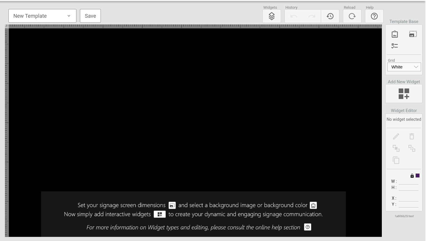
The three entries under this section are:
¶ Template Background
Clicking this icon will bring up the main template background settings.
In this tool you can select the background color and/or set an image to be used as background. The image resize-mode can be set as:
-
Stretch - the image is stretched to fit the entire template background.
-
Cover - the image is resized to over the template background without changing its aspect ratio. This may cause the image to be cropped.
-
Contain - the image is resized to the largest size possible whilst fitting inside the template background and without changing the aspect ratio. This may cause the template background to be entirely filled by the image.
¶ Template Size
Clicking this icon will open the template size configuration tool. Here you can select from a predefined set of resolutions or set your own custom resolution. Note that the editor will scale the viewport to fit in your browser so even when working on high-resolution templates, you will see the entire template viewport.
¶ Template Display Conditions
This setting is only useful when working with room boards and directions!
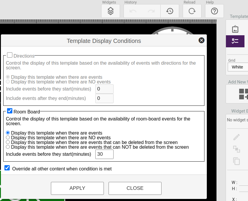
Clicking this icon will bring up the display conditions tool. Display conditions are special rules that will be used to determine if the template should be displayed or not, even when part of a timeslot in a playlist.
There are two main sets of data to base the display conditions on:
-
Directions events - these are any events schedules for locations to which the screen displaying the template has a directions configuration. For this data, one can set a number of minutes prior to the first event, and a number of minutes after the last event in which the condition will still be considered met.
-
Location events - there are any event scheduled for the location to which the displaying screen is bound. For this data one can set a number of minutes prior to the event that will still count as the condition being met.
For both types of conditions, the negated counterpart can also be set. This makes it easy to create an inverted condition that is to be displayed when there are no events.
For Room Boards, there are also two advanced options to display a template only if it has an ongoing/upcomin event that can be deleted from the display, or that can NOT be deleted from the display. This is to facilitate the creation of on-screen booking.
Example: Location
A display is mounted outside a meeting room and bound to that location in the system.
The current template will display the ongoing and next meeting. The customer wants
the display to start showing an upcoming event 30 minutes prior to the event starting.Use the Location Events condition with the Display this template when there are
events setting and Include events before they start set to 30 minutes.
One can also enable the override all setting that causes ONLY this template to display if the condition is met, overriding ALL other content in the current timeslot.
¶ Widgets
A page can hold multiple elements called widgets. Widgets are specialized components that renders spesific data based on a configuration.
Elements can be styled using CSS as part of the per element configuration, or styling can be done on the page level.
¶ Text Box
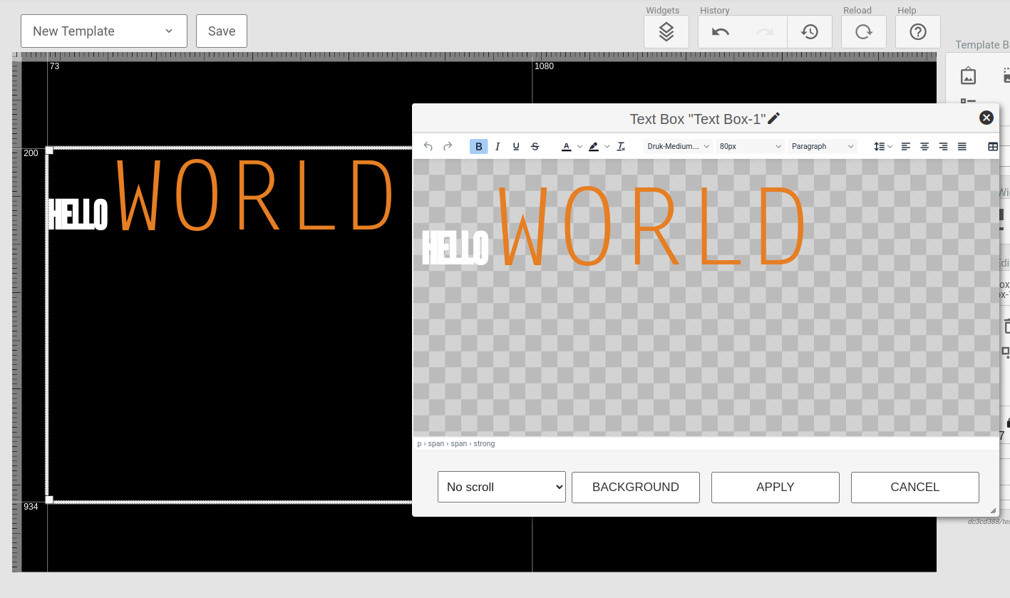
The Text Box widget provides a what you see is what you get editor for crating static text sections. The widget does support templating and dynamic functions.
¶ Image
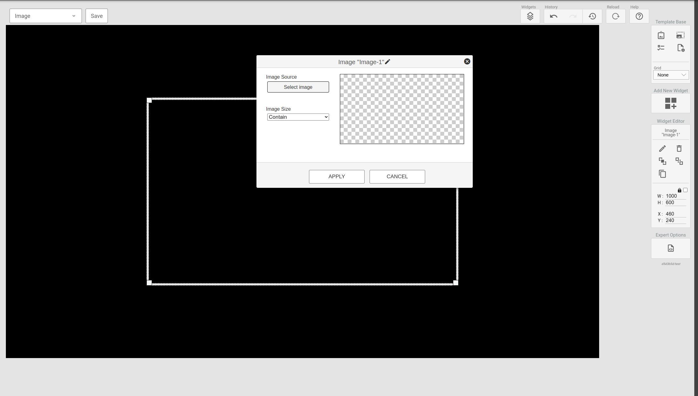
The Image widget serves as a straightforward solution for displaying single images within a designated section of the template.
¶ Clock
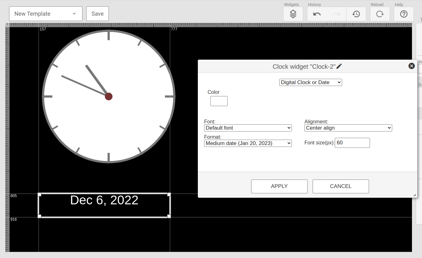
The Clock widget provides a self-contained clock and date display widget that can render both a analogue clock or digital output in various colors and formats.
¶ Weather
The weather widget will display a weather forecast for a defined destination. The destination is set on a map and the number of days can be adjusted along side various formatting options.
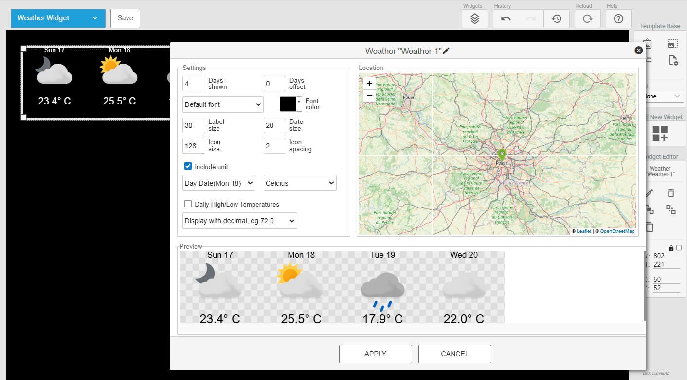
By default, the weather widget displays the daily average temperature. This value takes the hourly forecast from the weather data source and averages that value out across the same day. Alternatively, users may select the checkbox titled "Daily High/Low Temperatures" to instead display the minimum and maximum values from the weather data set. This option is recommended for users displaying multiple days of weather data.
Optionally, users may disable or enable the additional decimal value by using the dropdown menu in the widget conifguration pane.
¶ Flights
The flights widget provides an easy way to display departure or arrival data for an airport. The widget supports paging and various paging parameters can be set in adittion to the layout options available.
NOTE: The flights widget is only available if a flights-license is set up for the site. The available airport data is defined as part of the license setup. When data for multiple airports is needed, multiple licenses will be required.
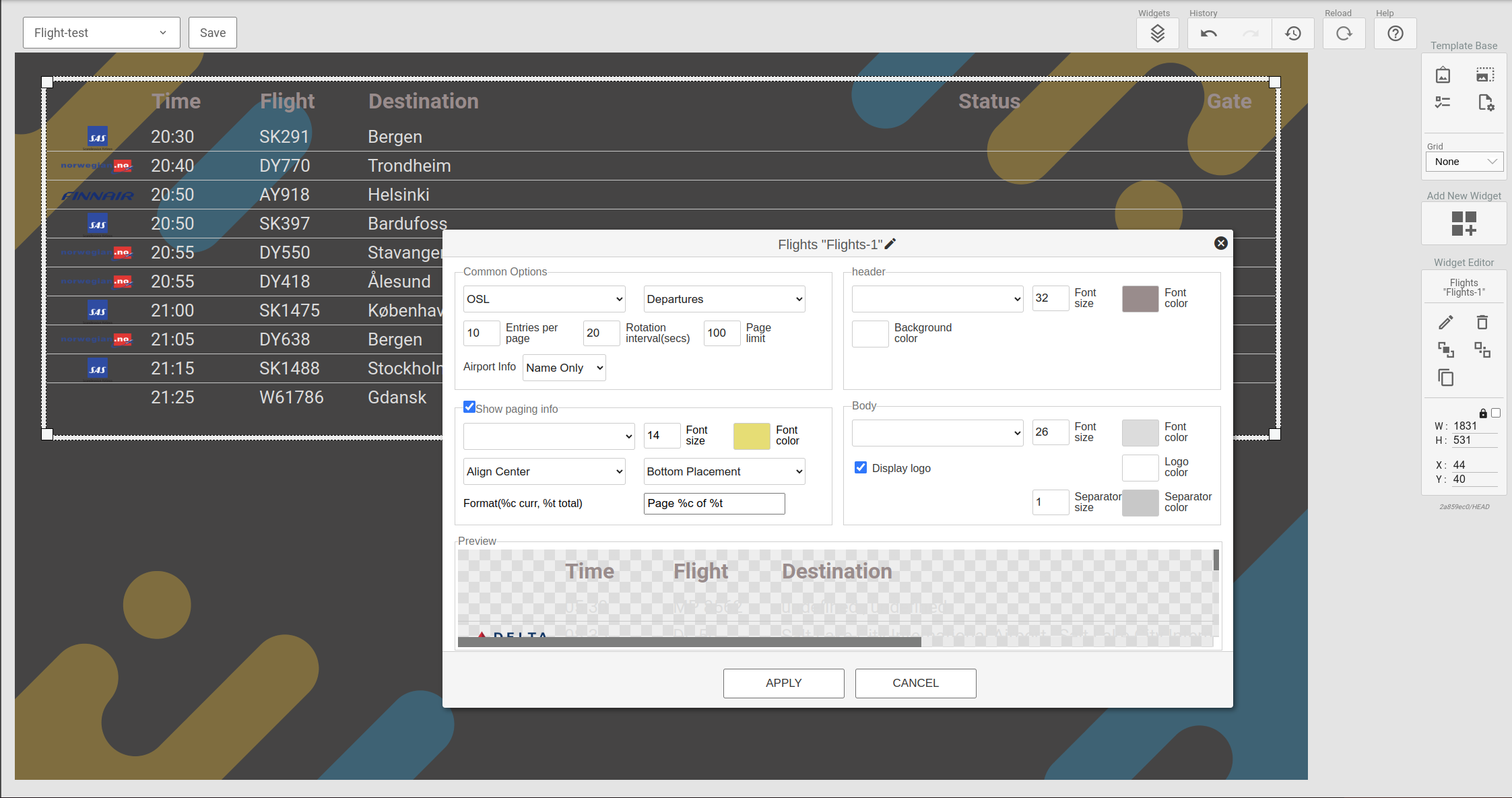
One thing to note regarding the 'Airport Info' field: When selecting City or City and IATA, you might get different info when fetching flight data for Norwegian airports than for international airports. The City field will contain the same info as the Name field for Norwegian airports, but correct info for international airports.
¶ Video
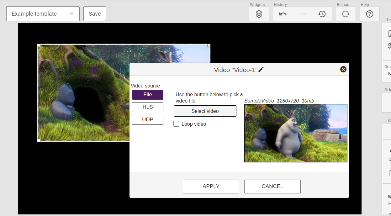
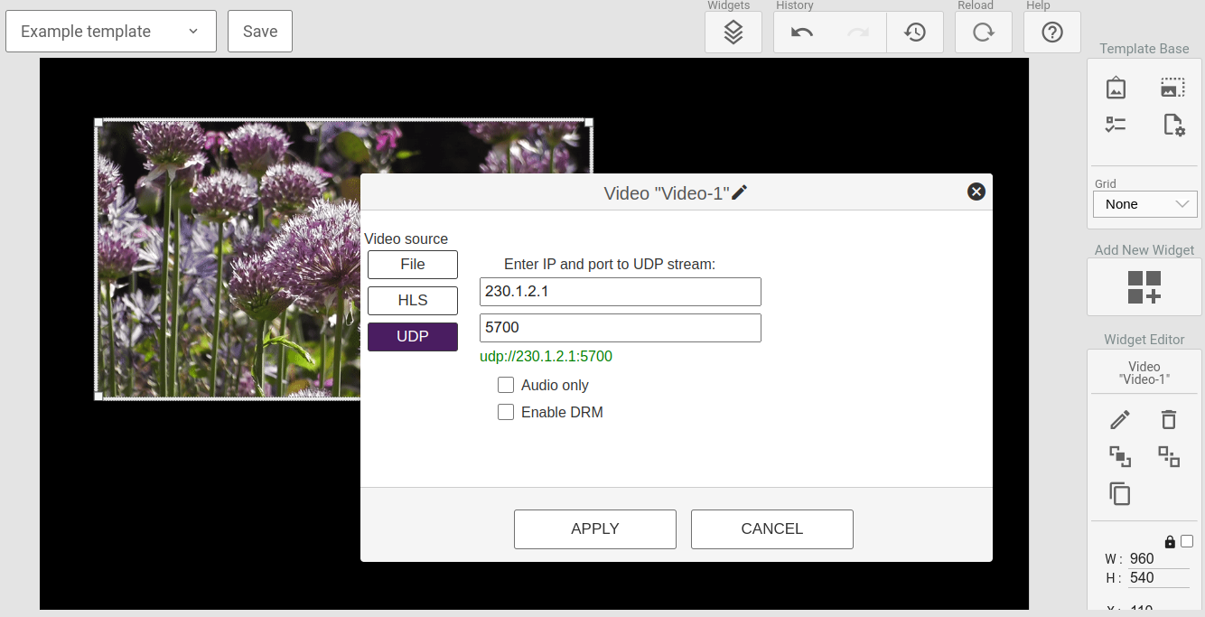
The Video widget provides a mean of playing a video in an area of the template. The video element supports three different type of sources listed below together with their configuration parameters:
- File
- Selected from the uploaded video resources
- Livestream using HLS
- URL
- Audio only
- Livestream using UDP
- IP
- Port
- Audio only
- DRM
NOTE: Livestreams (HLS and UDP) is currently only supported by the 4K2 and HD4 external players.
When using a file, the widget editor will show a small preview of the video. However, for livestreams (both HLS and UDP) it is not possible to show a preview so it will show a placeholder image instead.

¶ External Input
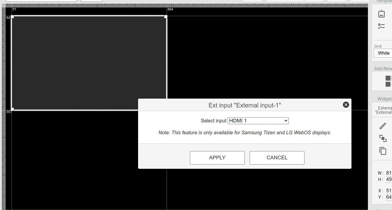
The external input allows for displaying content from an HDMI input in an area of the template. This could be an external STB or a PC etc.
NOTE: The external input widget only works on a limited selection of displays. This includes all LG WebOS displays and all Samsung Tizen displays.
¶ YouTube
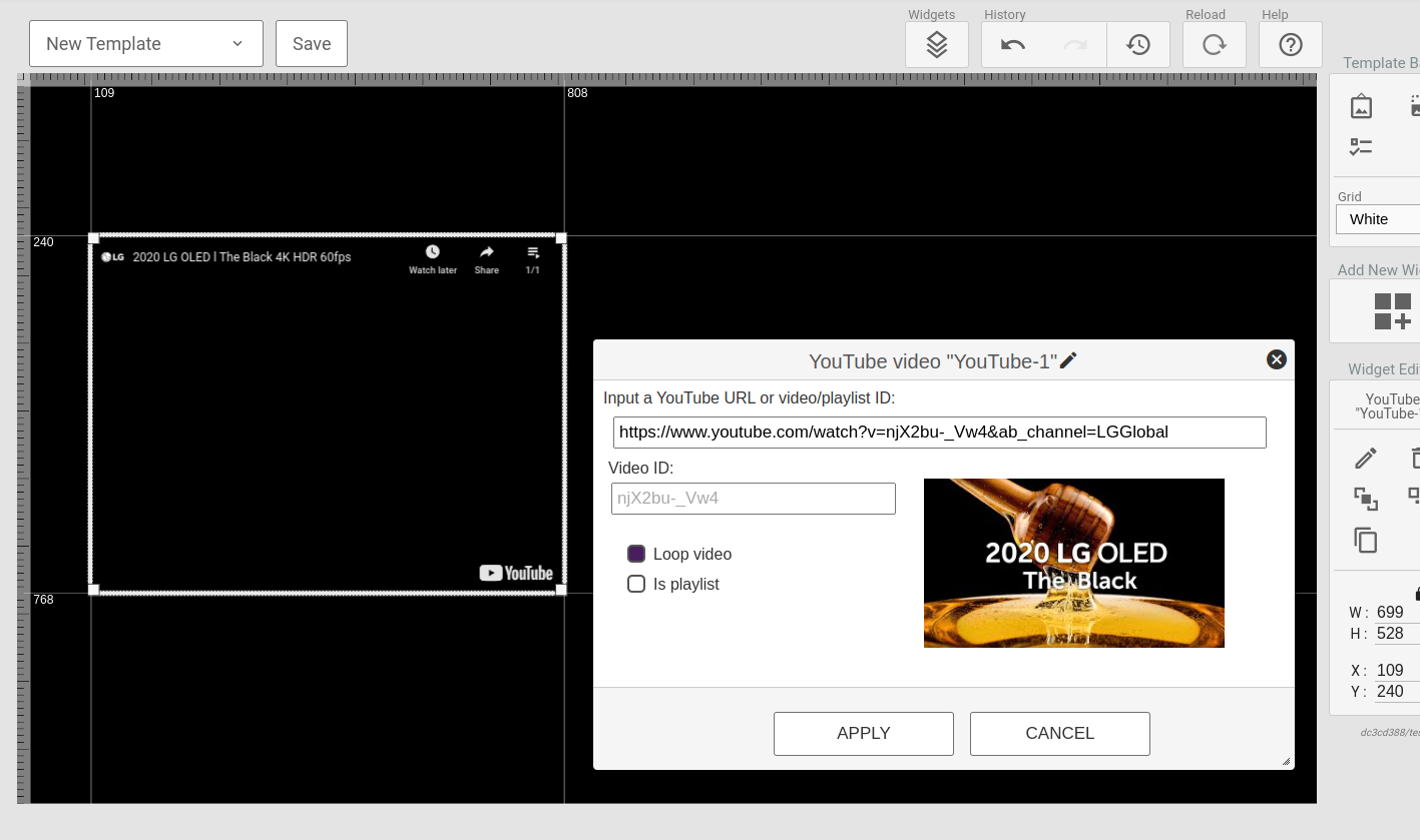
The YouTube widget provides an option to play a YouTube video or playlist. This widget is Best-effort, meaning certain displays might not support it based on their browser capabilities.
The configuration tool allows you to search for video via YouTube URLs or video/playlist IDs.
NOTE: YouTube in portrait mode on Samsung Tizen is only supported using the 270° rotation.
¶ Playlist
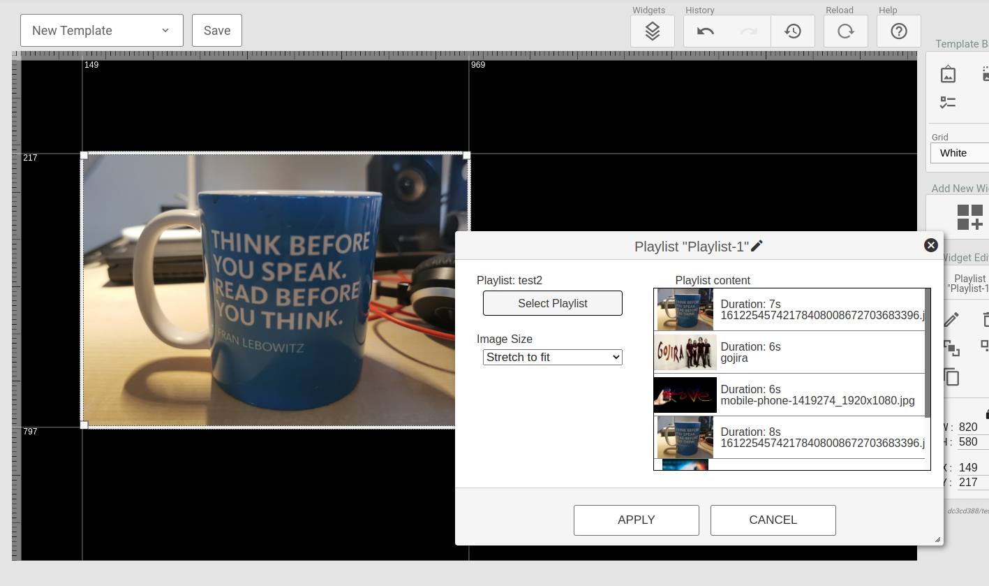
The playlist widget supports displaying a playlist of images and videos within a set area of the screen.
NOTE: A playlist cannot contain templates!
¶ Document
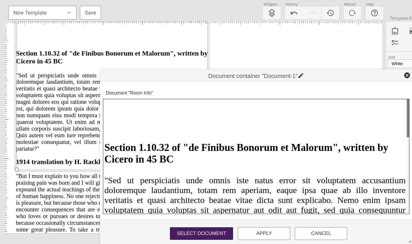
The document widget allows one to display the content of a document. This allows users without access to the template editor to change the content of a template.
The configuration window will allow you to select and preview a document. To edit the document you need to visit the Content -> Documents section of the management portal.
¶ Data Table
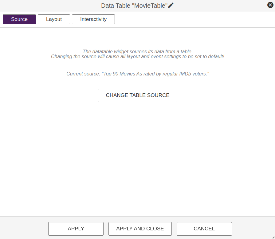
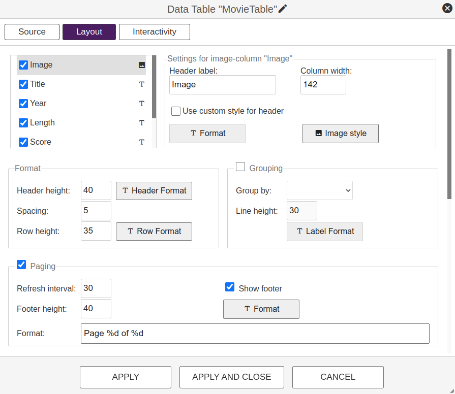
The data table widget allows one to display the content of a table in a template. This again allows users without access to the template editor to change the content of a template. A typical example would be a price list where users can update the product list and pricing without any need of accessing the template editor.
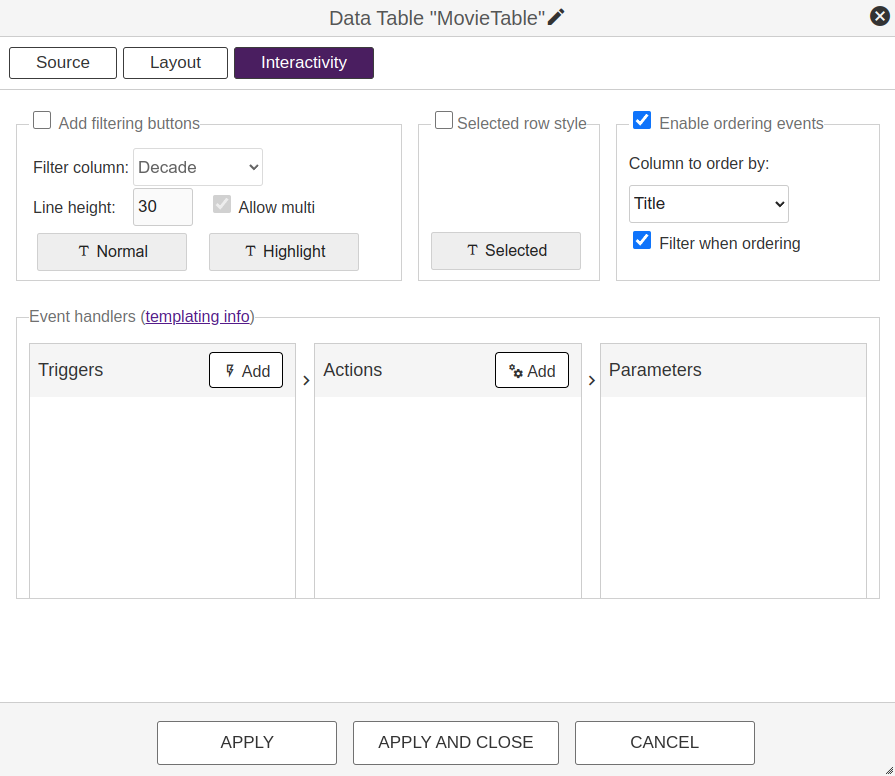
The configuration window will allow you to select the table to use and configure the layout including settings for headers, rows, images, paging and grouping. To edit anything content-related such as the order of columns or rows, you need to visit the Content -> Documents section of the management portal.
¶ Dynamic Layouts
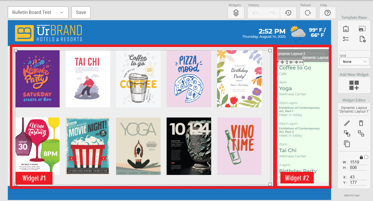
The Dynamic Layouts widget allows one to display the content of a Dynamic Layout in a template. This allows users to create a purpose-built design for data-based content without being restricted by the availability of certain Widgets or configuration settings in the Signage Template concepts.
¶ API-Template
This widget will display the output of an API-template, fetching and converting data from a remote HTTP source. Read more here.
![]()
¶ WebPage
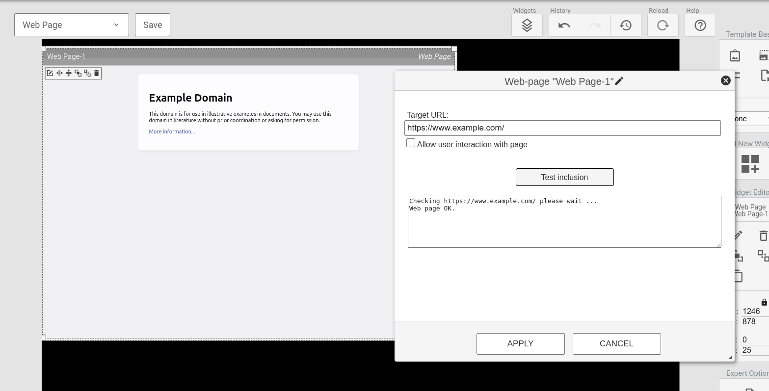
The WebPage widget will display content from a provided URL in an iframe, embedding a complete webpage.
To embed a webpage, certain configurations need to be present in the web-server hosting the page. A test function is included in the configuration tool to verify the inclusion capabilities of a URL.
To control user interaction with the webpage, toggle the checkbox. Check the box to enable interaction or uncheck it to disable.
When the interactive web widget is active, you can navigate the webpage using standard touch gestures, including scrolling and clicking. If interactivity is disabled for a specific web widget, clicking on it will have no effect.
User interactions, including scrolling and clicking, are enabled by default on all existing web widgets.
Note: Interaction was introduced in week 49, 2023. To disable it for widgets created earlier, re-add the widget and configure the interaction settings accordingly
¶ WebFeed
The WebFeed widget is used to display RSS feeds from external sources.
It fetches news from an external URL (e.g., BBC News feed in this case).
There is configurable autoscroll options (right-to-left, left-to-right, and vertical)
Customizable Appearance. Users can adjust font size, color, borders, and spacing.

¶ QR-Code
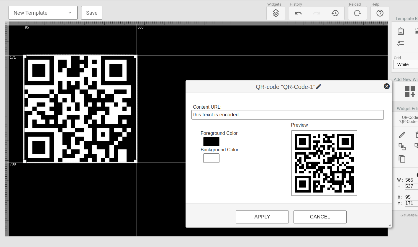
The QR-Code widget encodes a text(this can be templated) as a QR-code displaying in the widget area. The foreground and background colors can be set(including transparency).
¶ Slider
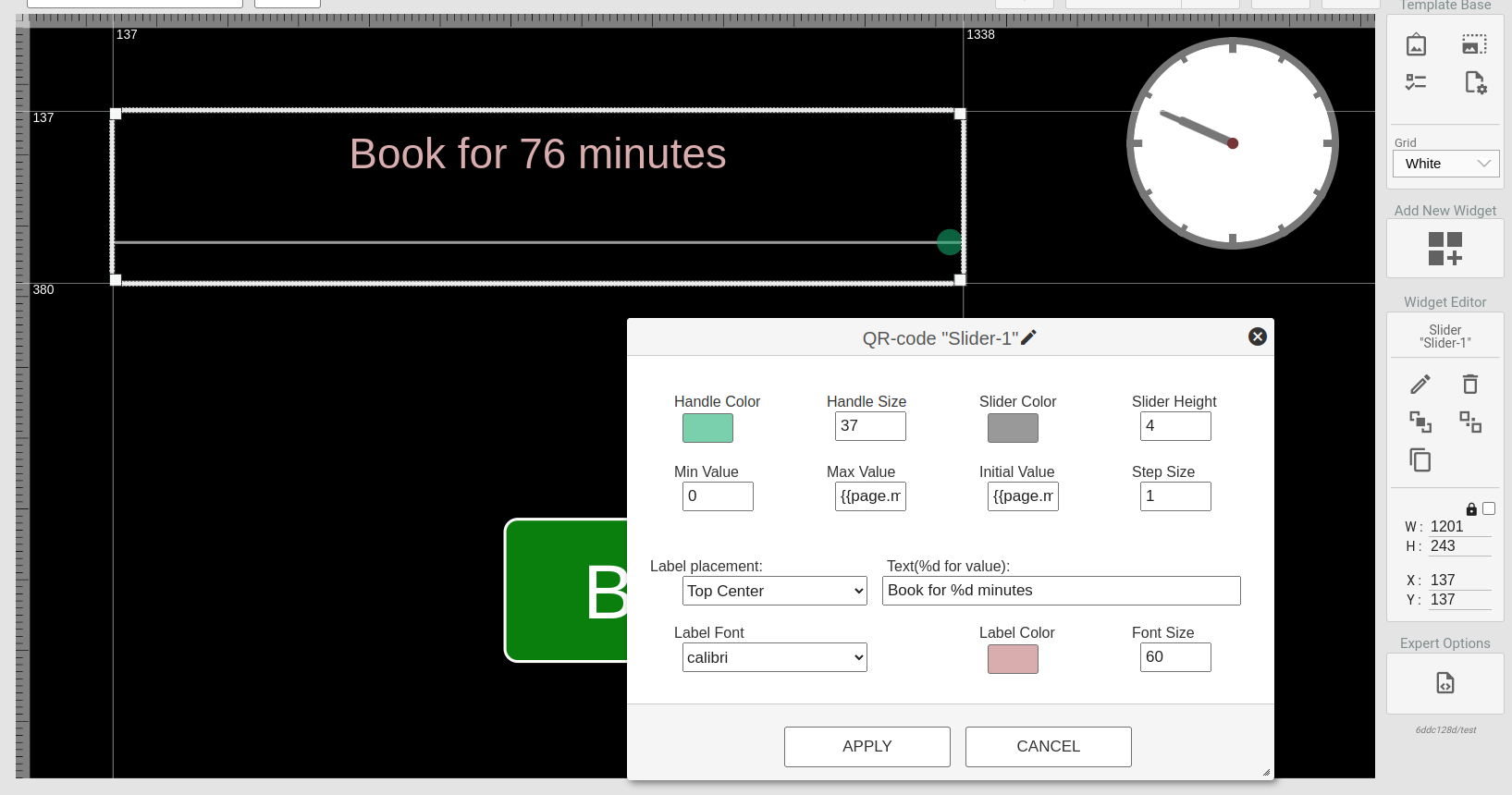
The Slide widget allows for users of a touch-screen device to set a value based on given minimum and maximum values. This can be used in combination with the Container widget to create interactive services.
Minimum, maximum and initial values can be templated.
¶ Container(advanced)
The Container is an advanced widget inherited from the TV Template system.
Read more about it here.
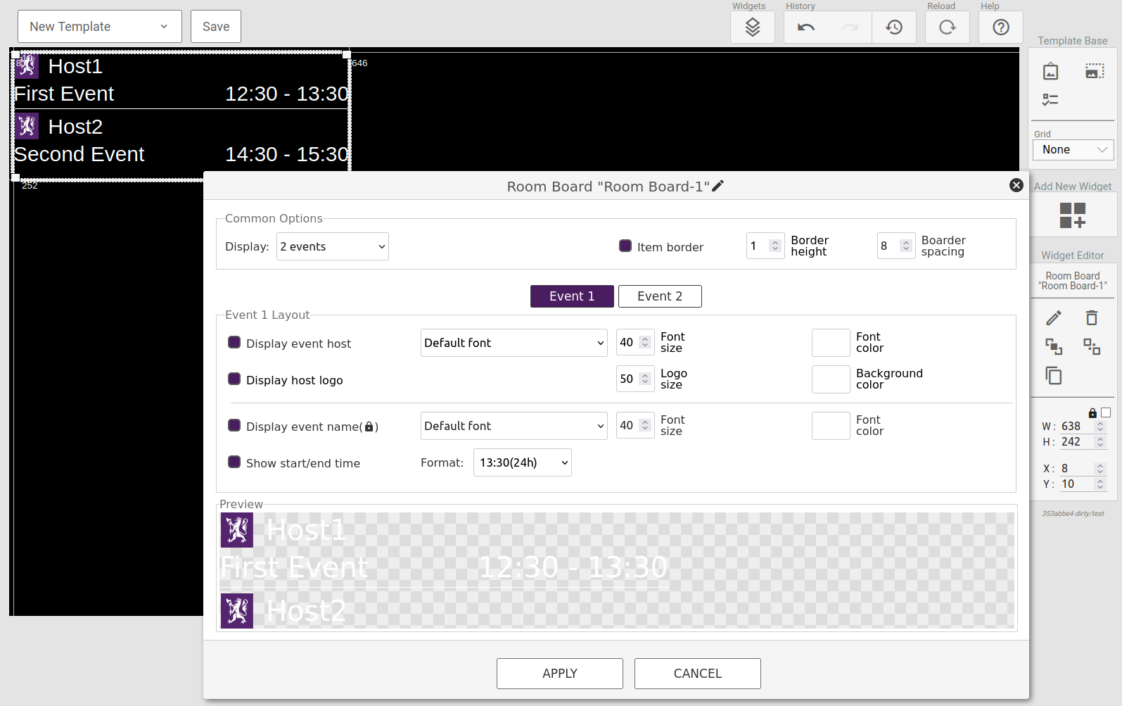
¶ Room Board
NOTE This widget is only available if the site has the events license
This widget will display the current and next events for a location with a variety of options to customize the look of the events to be displayed.
You also have additional options of when to display the room board on a display. Read more about it here.
¶ Directions
NOTE This widget is only available if the site has the events license
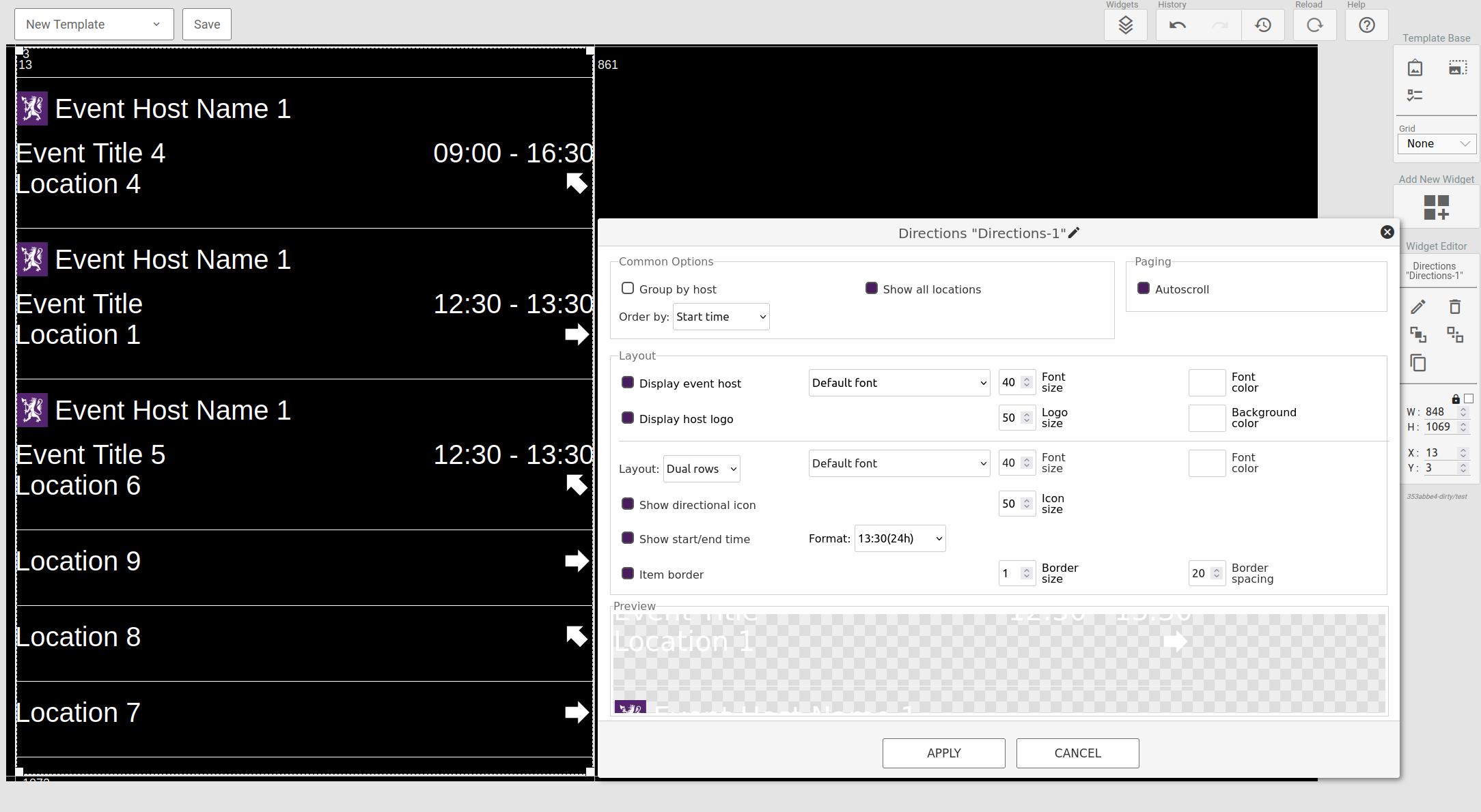
This widget will display events for the current day based on a displays directional configuration. There are multiple options such as displaying all location(Even those without any events), displaying multiple events(not just ongoing/next upcoming), group by host etc.
¶ Language Selector
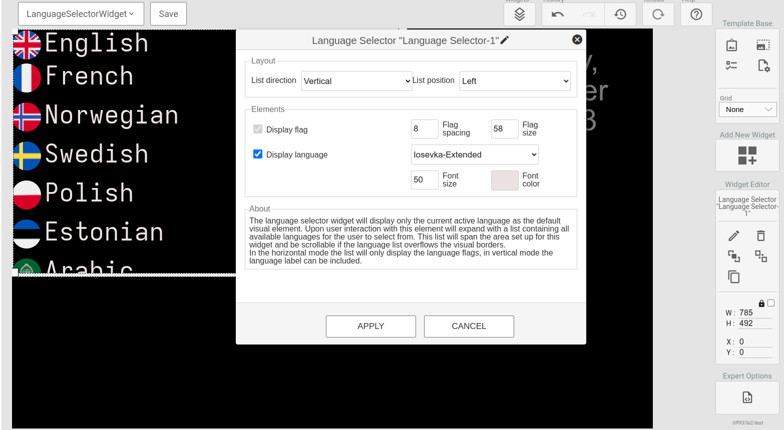
NOTE This widget uses the list of available languages from Signage Config, and the default language set on the site.
This widget will display an interactive list of available languages. With the list, you can change the selected language by touch. There are multiple options such as vertical and horizontal direction, display language to choose between text and no text.
¶ Alphaslider
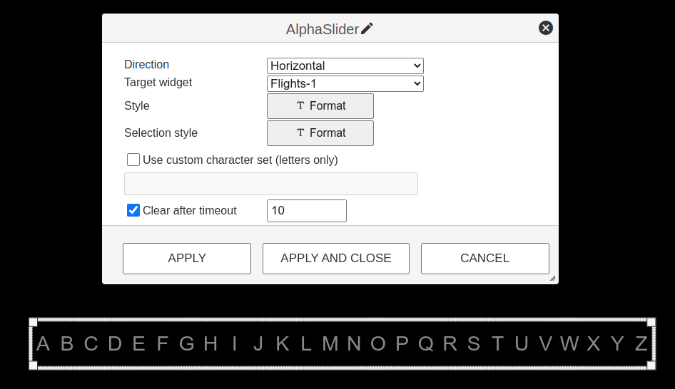
The alphaslider widget gives us the possibility to filter or sort data in a data table widget, by sliding your finger or mouse cursor across letters. There are several options such as vertical and horizontal direction, styling of the letter and the selected letters, clearing selection after a duration of interactivity and the possibility to use a custom character set. In the configuration view for the data table, you can configure which field to sort on and several other options.
¶ Wayfinding Map
NOTE This widget is only available if the site has the WayFinding license. Users must have their account access updated to include the 3DWayfinding role.
To use the licensed widget, a Map ID must be added. Map IDs are generated by the Uniguest during map creation. Please reach out to your account manager to inquire about map creation services.
NOTE Following player devices supports wayfinding -
With non-interactive screen: Janus, HD1, HD4, 4K2, Samsung QMC, Samsung QMB.
With Touch Screen (UL3J-M or QMC): Janus, HD1, HD4, 4K2.
The Wayfinding widget allows a user to display an interactive or static building map on a template.
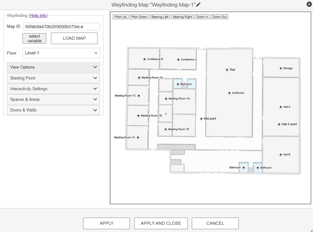
The Widget is divided into 6 sections:
1. Map ID & Floor Configuration
Map ID :: Enter the Map ID provided by Uniguest and choose Load Map to preview the map. Alternatively, if a Map ID value has been added to the Adminstration > Variables module as a text type variable, the variable value may be selected in lieu of entering the Map ID into the field.
Floor :: If editing a map with multiple floors, use this dropdown to select a different floor to edit or to place the You Are Here point on a different floor.
2. View Options
Map Type :: Select a Single Floor view or a Stacked Multifloor view.
- Note that maps with only one floor should use Single Floor. If using a multi-floor map with Single Floor view, the floor will automatically change when users navigate to an endpoint not located on the floor with the You-Are-Here point.
Hide Floor Selector :: When enabled, hides the map's Floor Selector dropdown.
- By default, an interactive floor selector is shown on the bottom-right corner of the map. On interactive displays, users may touch this to switch the currently displayed floor. On non-interactive displays, it may be preferred to hide this box as it could mislead users to assume the screen is interactive.
Show Street View :: When enabled, displays map content outside of the buidling.
- By default, only the building walls and interior are shown on the map. When this toggle is enabled, users can display an exterior view of the property to include nearby streets and buidlings. This setting is only recommended when the Map's world position has been accurately set.
Map Camera Placement :: Not configurable, but this field shows the current Pitch, Bearing, Zoom Level, and Center coordinates. Adjust the camera settings by using the buttons above the map on the right side of the configuration pane, or by right-clicking and holding on the map to use your mouse to reposition. This is essential to ensure the map is presented in alignment with the physical location of the sign, optimizing the layout for the sign’s orientation and template design.
Dynamic Labels :: When selected, room & point labels will automatically appear or disappear depending on the map's zoom level and what endpoint is selected as part of a wayfinding action.
- Label Text Size (in pixels) :: Adjust the size of the labels displayed. Larger labels will result in fewer displayed.
- Label Margin Size :: Adjust the margin size to provide more padding between labels.
- Label Density :: Adjust the amount of labels shown. Low will show the fewest labels, while Always visible will show all labels. When more labels are shown, they will potentially collide or overlap.
Custom Labels :: When selected, room labels are treated like a static object that can be individually resized and repositioned. Additional configurations are required under the Spaces and Areas section.
- Global Rotation :: This setting changes the rotation (in degrees) for all labels at once. Individual label rotations may be customized in the Spaces and Areas section.
The Floor Selector allows users to choose and navigate between different floors. To display a "You are here" pin, simply click on the desired location on the map in the Wayfinding Map editor. The color of the "You are Here" label and icon can be customized to align with branding requirements. Adjust the camera's placement to set the desired orientation, pitch, and zoom level for the wayfinding map using the buttons on the map panel. This is essential to ensure the map is presented in alignment with the physical location of the sign, optimizing the layout for the sign’s orientation and template design.
3. Starting Point
Select "You Are Here" Location :: Once pressed, you may select a position on the map to place the you are here starting point. All wayfinding will begin from this point.
Alternatively coordinates may be configured as a variable under the Adminstration > Variables module and the variable value may be referenced instead. This setting is useful for managing a map that will be used on multiple kiosks throughout a building.
Label Color :: Choose a color for the You Are Here label.
Icon Color :: Choose a color for the You Are Here icon.
4. Interactivity Settings
Floor Camera Focus :: When enabled, floors of differing sizes in the same building will be automatically resized to fit the Wayfinding Widget dimensions. This ensures a smaller floor does not appear too small to read.
Max Zoom Level :: Requires Floor Camera Focus to be enabled. Determines the maximum zoom that will be applied by the Floor Camera Focus feature. Max value is 22.
5. Spaces & Areas
The configurable options in this section change depending on the Labeling selection in the View Options group.
Available for Dynamic Labels + Custom Labels:
Floor Color :: After selecting a space on the right, choose a color to assign to the space's floor.
Floor Texture :: After selecting a space on the right, choose a texture to assign to the space's floor. Textures are images upload to the Hub Media Library.
Reset this Space :: Removes all customizations applied to the above or below configurations for the currently selected space
Reset All :: Removes all customizations applied to the above or below configurations for every space in the map.
Available for Custom Labels Only:
Label Text :: Adjust the text shown. Wayfinding actions are based on the label shown in the upper right corner, so these may be customized to something different or include line breaks that better fit the space dimnesions.
Label Type :: Choose from 3D Label, Marker Icon, or Hidden. When Hidden, the label will not display on the map.
3D Label :: Show a room's label as a flat, editable text field.
- Font Size :: Adjust the size of the room label.
- Rotation (degrees) :: Rotate the label to the desired position.
- X-Axis Offset :: Adjust the horizontal position of the label.
- Y-Axis Offset :: Adjust the vertical position of the label.
- Z-Axis Offset :: Adjust the distance between the label and the map floor. Useful for labels that need to overlap walls
- Fill Color :: Customize the label's color.
- Outline Color :: Customize the label's outline color.
- Outline Width :: Adjust the outline width.
Marker Icon :: When selected, icons representing the space appear above or instead of the label.Can be useful to avoid repetitive labels for egress points or restrooms.
- Icon :: Choose the icon type: Elevator, Restroom, Stairs, Exit, Information
- Marker Color :: Customize the marker's color as displayed on the map.
- Show space name :: When selected, the icon will include the space name. Disable to only show the marker.
6. Doors & Walls
Type :: First, choose an element to update from the dropdown menu: Doors Exterior, Doors Interior, Walls Exterior, Walls Interior
Visible :: Hide or show the selected element.
- Color :: Choose a color for the side view of the selected element.
- Top Color :: Choose a color for the top view of the selected element.
- Texture :: Select a texture for the side view of the selected element.
- Top Texture :: Select a texture for the top view of the selected element.
- Opacity :: Adjust the opacity for the selected element.
¶ Widget interactivity with Wayfinding
The Wayfinding Map supports touch interactivity through adding interactivity (eventhandlers) to other widgets.
The widgets that can utilize interactivity are:
- Data Table
- Directions
- Dynamic Layouts
- Text
- Image
- Container
New Actions
- Draw Wayfinding Path
- A line is drawn from the "You Are Here" point to the selected destination.
- Highlight Destination
- The destination room is highlighted to call out its location on the map.
- Zoom To Destination
- The map’s camera moves to show the selected destination.
- Reset Wayfinding Map
- The map with “You are Here“ label returns to original state
¶ Additional features for Data Table, Dynamic Layouts, or Directions interactivity with Wayfinding
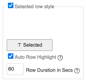
For instances where a non-interactive solution is used but event triggers are still needed to show wayfinding actions (or trigger other interactions), automatic row highlighting enables a user to specify a cadence at which the next row in a data set should be selected and interactivity actions are triggered.
In the Data Table, Dynamic Layouts, or Directions widget configuration pane, an additional Automatic Row Highlighting parameter is added under the Interactivity tab so the user can specify whether this feature is enabled and how long each row should stay "highlighted" before moving to the next row.

¶ Templating
In the Text Box and Container widgets you can use the Mustache templating language to expand variables in the content. For certain other widgets such as the QR-code and WebPage, templating might be used in the widget configuration settings.
Let's assume we have the following templating data available as "info":
{
  "title": My Title",
  "text": "Some text"
}
For a markup section we could then set:
<div>
 {{info.title}}<br>
 {{info.text}}
</div>
The mustache rendering engine will then output:
<div>
 My Title<br>
 Some text
</div>
¶ Global variables
A selection of global variables are available to all menu-pages. These might differ from screen model to screen model. Here follows a list of common populated variables.
Escaping of variables
All variables are HTML escaped by default. If you want to return unescaped HTML, use the triple mustache: {{{name}}}.This is useful in situations where you need a working URL, e.g. in slideshow, web content or web requests.
| Variable | Content |
|---|---|
| settings.locationName | The name of the location the TV is registered to |
| settings.duid | The unique device-ID of the screen |
| ------------------------- | --------------------------------------------------------------------- |
| roomBoard.locationName | The name of the location for the first upcoming event. If no upcoming events, the name of the primary location of the display(signage displays can be assigned multiple locations). |
| ------------------------- | --------------------------------------------------------------------- |
| softAP.enabled | true if the built in TV softAP is enabled |
| softAP.ssid | SSID of built in softAP |
| softAP.key | Key of built in softAP |
| ------------------------- | --------------------------------------------------------------------- |
| media.playingNameTv | Get the name of the current playing TV channel if available |
| media.playingIdTv | Get the ID of the current playing TV channel if available |
| media.activeSubtitleLanguage | Get the (iso-639-1)language code representing the current-active subtitle language. |
| media.activeSubtitleFlagUrl | Get a relative path to a language flag icon representing the current-active subtitle language. |
| ------------------------- | --------------------------------------------------------------------- |
¶ Functions
Certain dynamic functions can be called from the Markup of containers. These are enclosed within hashes #
Example:
Current time: #getTime(HH:mm)#
Might be rendered as:
Current time: 13:00
The following functions are available:
¶ getTime(format)
Returns the current system time as formatted by the format parameter.
Format:
m - minutes
mm - minutes, padded to two digits
h - hours, 12 hour format
hh - hours 12 hour format, padded to two digits
H - hours, 24 hour format
HH - hours, 24 hour format, padded to two digits
D - day
DD - day, padded to two digits
DDD - weekday name(english), short version
DDDD - weekday name(english), full version
S - numer endring for day of month: th, st, nd or rd
M - month
MM - month, padded to two digits
MMM - month name(english), short version
MMMM - month name(english), full version
YY - year(two last digits)
YYYY - full year
t - AM/PM indicator a or p
tt - AM/PM indicator am or pm
T - AM/PM indicator A or P
TT - AM/PM indicator AM or AM
o - Timezone offset
Z - UTC offset string(eg UTC+0200)
o - short UTC offset string(eg +0200)
Example getTime("HH:mm DD.MM.YY")
¶ formatTime(timestamp, format)
Format a timestamp for display. The timestamp string must be on a format that can be parsed by the JavaScript Date object.
The format definition follows the same syntax as for the getTime function.
¶ formatNumber(number, numDecimals)
Formats a number with a specified number of decimals. Max number of decimals: 10
¶ getEpgCurr(channelId)
Returns the current running program for the defined channelId
¶ getEpgDescCurr(channelId)
Returns the description of the current running program for the defined channelId. Note, this can be a long string and formatting for overflow must be taken care of in markup.
¶ getEpgCurrProgress(channelId)
Returns an integer between 0 and 100 representing the progress of the current running programme. Can be used to build a progress bar.
¶ getEpgNext(channelId)
Returns the next program for the defined channelId
¶ getEpgDescNext(channelId)
Returns the description of the next program for the defined channelId. Note this can be a long string and formatting for overflow must be taken care of in markup.
