In this section you will learn about the main page properties, the various menu elements that are supported and how they are used.
Tip! Read up on adding dynamic content using templating and functions, as these are much used in pages and elements.
¶ Page
A page represents a single UI entity that holds a state and has some basic display properties. Multiple elements can be added to a page to build advanced visuals and intricate event handling.
¶ Page categories
You can tag your page with various categories by pressing the cog in the page entry in the menu editor upper left drop-down:

The categories set define if this page will be available as a selection in other parts of the system. Mainly this relates to the screen configurations settings where eg only pages tagged as "Main menu" can be set as the main menu in a configuration. But there are other cases - one example is when ordering a wakeup from the portal. The wakeup page to set only allows selecting pages tagged as "Wakeup Alarm".
¶ CSS classes
Custom CSS-classes can be set on page level under the page settings tab in the page settings window. These can be used to form selectors in the global CSS documents.
¶ Custom ID
The CustomID setting is available under the page settings tab. This is a very specialized property used to make sure the screen application can respond to certain messages from the system. An example is the stream allocation service. These are the IDs used by the system:
- allocated-stream - used to define a page as a stream-allocator display page. This page will be closed(if open) if the system signals that the allocation-session has expired.
¶ CSS rules
A main CSS configuration for the page level can be set in the editor by opening the page settings window.
The following classes are applied to the menupage and it's sub-elements:
¶ .m-menupage
Matches the page element. Here you can eg. set the page background, main font, colors etc.
¶ .m-menuitem
Matches all menu elements regardless of type. In the page CSS settings you can manipulate the style of ALL the menu elements added in one place.
Can also be combined with menu element specific classes such as .m-menuitem .m-highlighted to match all menu elements in the highlighted state.
You can set one or more custom CSS classes on your elements. From the page level you can define rules matching these eg .m-menuitem .mycustomclass
This provides an easy way of styling groups of items from the page level.
¶ Global Stylesheets
The page can include any number of the stylesheets defined in the global stylesheet editor.
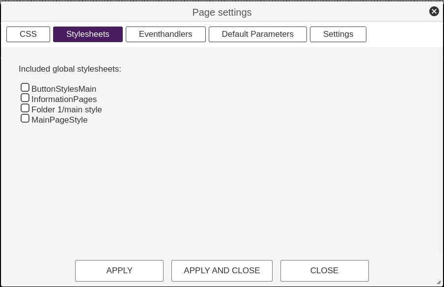
These stylesheets can be used to set shared CSS definitions. It's recommended to use custom CSS classes on page-elements in combination with the global stylesheets to allow multiple item styles in just a few stylesheet documents.
The global stylesheets are scoped to a page level so the selectors work the same way as the CSS defined for the page. This is unlike the page-element CSS which is scoped to a single element.
¶ Page Parameters
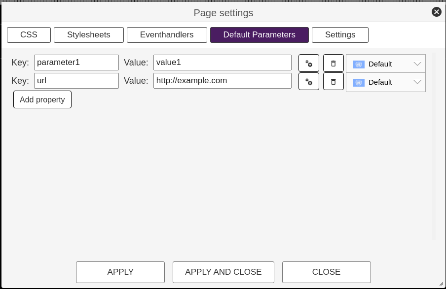
A page can be passed a set of parameters from the source that opened the page. Much like you pass query-params to a web page. Page parameters can be accessed when templating via the page object. You can also set default page parameters in the page configuration, these will be provided if no parameters were passed from the page creator.
In a template you can access eg the parameter name as {{page.name}}
¶ Events
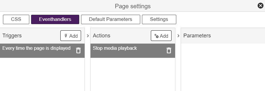
The following events are emitted on the page level and can be used in event-handlers in the page settings window.
¶ User pressed any key
This event will fire upon any key pressed by the user. The specific key events will also trigger. This is to catch a "press any key" type event.
¶ Page is loaded
Fires when the page is initially done loading and ready to render. Will only fire once during the lifespan of the page.
¶ Page is displayed
Fires every time the page goes from being hidden/overlapped to be displayed in front.
¶ Page was hidden
Fires every time the page goes from being displayed to hidden. Either by being closed, or by being completely overlapped by a non-modal page.
¶ All specific key events
Events are fired for all keys. Numeric 0-9, navigation and more specialized keys.
NOTE
If a key is handled in on of the page elements, it will not go on to be processed on the key level
¶ Page Settings
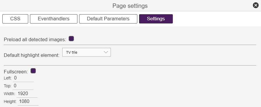
These settings are available in the page settings window under the settings tab.
¶ Preload images
You can disable the page image preload function if wanted. Preloading is enabled by default and it should always be active except for very special cases.
¶ Default highlight
Page elements have two basic states: normal and highlighted. The highlighted state serves as the main navigation concept, and only one element should be highlighted at any time - keep in mind, this is the underlying technical state. Visuals can be built using eventhandlers to modify any page element when highlight-state changes.
In the page settings, you need to set the default page element to be highlighted. The editor will automatically set this to the first element you add.
¶ Page size
A page can be either be running in full screen, or windowed. For a windowed page, the top right corner coordinates are set in addition to the width and height. A windowed page will be rendered on top of the underlying page.
¶ Elements
A page can hold multiple elements. Elements are page components that renders data, hold a simple state(some has more advanced internal states) and deal with eventhandling.
Elements can be styled using CSS as part of the per-element configuration, or styling can be done on the page level.
The basic element has two states: highlighed and normal.
¶ Translatable content
For information on how to build multi-lingual content, check the Working with translations tutorial video.
¶ Container
The container is the most versatile and generic element type available. For any item in the page that does not have special needs for layout/navigation or media content, this is the element to use.
Content can be set based on the highlight and normal states.
There are multiple types of content that can be set for the container. Content is set independently for the highlighted state, and all content is replaced once the element is highlighted unless:
- The content type is None
- The content type is Markup and the content is empty
To clear the content of a container when highlighted, use Markup and just insert a single space
These are the available content types:
¶ None
No content. Same as using Markup with no data. Note that CSS is still applied to the container, so if using eg a background color, this color is still applied.
¶ Markup
HTML markup with support for templating various parameters using the Mustache templating language.
Example:
<h1>Welcome</h1>
<hr>
Welcome dear {{page.guestname}}
¶ Document
Render the content of a document.
The document ID can be templated and retrieved from a variable
¶ Table
Provide the content of a table as a JSON structure made available to the rendering engine for templating in HTML.
In addittion to the drop-down selection of the table to use, there are two buttons available when selecting the 'Table' content type:
- JSON - This button will display the JSON data made available to the rendering engine based on the current state of the selected table.
- Example - This button will display an example of a generic template rendering a table.
Due to the limitations of conditionals in the mustache templating engine, all headers and cells will contain a property named as the type of the data ("text", "image" etc.) with the value true. This way one can easily make sections that are rendered specifically for the different types.
Example of a JSON structure:
"table": {
        "headers": [
            {
                "id": "0bee7ede-661f-4a23-9b6a-39351db5632d",
                "name": "Name ",
                "type": "text",
                "text": true
            },
            {
                "id": "99aeef57-1c51-4c1f-b1dc-dc6b7fbc5a2f",
                "name": "Image",
                "type": "image",
                "image": true
            },
            {
                "id": "96c1b9e4-957a-4f94-963b-668b6ca0364e",
                "name": "Type",
                "type": "enum",
                "values": [
                    "Breakfast",
                    "Lunch",
                    "Dinner",
                    "Dessert",
                    "Beverage"
                ],
                "enum": true
            }
        ],
        "rows": [
            {
                "items": [
                    {
                        "value": "Sandwich",
                        "text": true
                    },
                    {
                        "value": "10",
                        "text": true
                    },
                    {
                        "value": "Lunch",
                        "enum": true
                    },
                    {
                        "value": {
                            "resourceId": "1234567890",
                            "resourceUrl": "https://...."
                        },
                        "image": true
                    }
                ]
            }
        ]
    }
The editor provides helper functions both to see the processed JSON-data for the selected table and a basic markup example templating the data.
¶ Template
Render the content of a template.
The template ID and template parameters can be templated and retrieved from a variable
¶ Remote URL
Fetch partial HTML markup from a remote source and inject into the container.
The URL can be templated and retrieved from a variable
The content MUST NOT be a complete HTML document with html, head or body tags
¶ Iframed URL
Fetch a complete HTML document from an URL and render into an iframe in the container.
The URL can be templated and retrieved from a variable
NOTE: Modern browsers do not allow loading unencrypted content(HTTP) from a page that was loaded via HTTPS. Since all applications in the portal are loaded using HTTPS, you will not be able to use a HTTP source in the IFRAME. However, many TVs load the application from local file storage, and HTTP sources might work there... So if you are in need of using a HTTP source, you will not be able to test in the editor or the client preview. You must then, yourself, verify that it works on the screens you aim to use.
In general we recommend that you always use HTTPS.
You cannot scroll the content of the iframe using key navigation. To achieve this, use the WebContent element.
¶ QR-Code
Render the provided data as a QR-code filling the containers space.
The QR code content can be templated and retrieved from a variable
¶ .m-normal
CSS that is applied to the element. This style is applied even if the element is highlighted, but the highlight class(as described below) will override styles set here.
¶ .m-highlighted
This class is applied the the element when it's in the highlighted state. The class is removed once the element loses highlight.
¶ Scroll [None, vertical, horizontal]
Defines if the content of the container should be scrollable. If enabled, the user can scroll any overflowing content(in the set direction) using the directional keys.
The Container emits the following events:
¶ Highlighted
When the element goes from normal to highlighted state.
¶ Lose highlight
When the element goes from highlighted state to normal.
¶ Selected
When the user presses the OK/select key and this element is in the highlighted state.
¶ Key input
All the numeric and specific key events.
NOTE
When using scrolling, the element will consume keypresses used to scroll when highlighted, e.g. it will not emit a DOWN keypress if the content was actually scrolled down. But once the content is scrolled to the bottom, the DOWN keypresses will be emitted when the key is pressed.
¶ Item List
The Item List is another very versatile element type that deals with rendering lists of data items. You will provide template markup for a single item, and the element will render one entry per item in the underlying dataset as according to the element configuration. Items can be rendered as a single list in horizontal or vertical mode, or as a grid.
The default highlithed element can be set using any key in the dataset and the value can be templated.
The element also handles internal navigation and scrolling.
The Item List can be set up with the same content type as the main Container. The most common case is to use Markup.
The big difference from the Container is that the content you define will be rendered once per item in the underlying dataset. The item data is available for templating trough the item object.
So if you just want to render a simple list of the name properties of the items in the dataset, you can do:
<div>{{item.name}}</div>
The Item List will then render one instance of this markup per item in the dataset and handle all layout and navigation.
¶ .m-normal
This class is applied to the whole list element. If you want a background for the entire list, it can be set here.
¶ .m-highlighted
This class is applied to the whole list element when it is in highlighted state. Keep in mind that the list will be in highlighted state as long as you can navigate it.
¶ .m-scrollitem .m-normal
Matches all items in the list.
¶ .m-scrollitem .m-before
Matches all items listed before the currently highlighted element.
¶ .m-scrollitem .m-highlighted
Matches the currently highlighted element.
¶ .m-scrollitem .m-after
Matches all items listed after the currently highlighted element.
¶ .m-indicator-up
Matches the up indicator, a visual element indicating the availability of scrollable items in the up or left direction.
¶ .m-indicator-up.m-active
Matches the down indicator if there are any more items to scroll up to.
¶ .m-indicator-down
Matches the down indicator, a visual element indicating the availability of scrollable items in the down or right direction.
¶ .m-indicator-down.m-active
Matches the down indicator if there are any more items to scroll down to.
¶ Data source
The datastore to use to populate the item. This can be a templated value.
Read more about datasources here.
¶ List layout direction
The direction to render the list. Horizontally or vertically.
¶ Disable Highlight
This will disable item focus, highlight and selection. The whole element will scroll just like a regular list container. Useful for rendering content from some API where further selection is not an option.
¶ Selector behaviour
Floating selector will move the selector and only scroll the list when a new element needs to come into view. Fixed selector will always scroll the list content.
¶ Align content(if selector not fixed)
How to align the content IF the selector is not fixed AND the content does not overflow(scroll).
¶ Selector placement(if fixed)
Where to place the fixed selector. A pixel offset from the top/left of the element.
¶ Space between elements
Number of pixels to pad between the list elements.
¶ Number of columns in a row(or rows in column)
Create a matrix by adding more than one column in a vertical list, or rows in a horizontal list.
¶ Size of elements
The pixel size of the elements. Width if horizontal, height if vertical.
¶ Size of scroll indicators
The size, in pixels, of the up/down or left/right indicators. Set to 0 to hide indicators. For vertical layout, the size will be set as the height, for horizontal layout the size will be applied as width.
¶ Animate scroll
If activated a CSS animation is set on the scroll movement of the list and the highlight movement(if not fixed position).
¶ Always highlight
Keep last highlighted element highlighted when the main element looses focus
¶ Default highlight key
The key value to match the default value for. If left empty the index(starting at 0) will be used, e.g. if you want to match a value with key "name", then set name here and the value to match in Default highlight value
¶ Default highlight value
A value describing the default element to highlight when the list is initially rendered. Based on the default highlight key Can be templated. Eg if you want to match an item with "name" like "John Smith" then set name as the highlight key and John Smith as the highlight value.
The Item List will emit all the same events as the Container. An item object is available for templating on various events such as when the item is selected.
In addition, you can add triggers for the following events:
¶ A sub-item is highlighted
Fired when an element in the list is going from normal to highlight state. The item property is available when handling this event.
¶ A sub-item looses highlight
Fired when an element in the list is going from highlight to normal state. The item property is available when handling this event.
Once the Item List reaches the bounds of its internal navigation(eg pressing up/left when the first element is highlighted), it will emit the keypresses for handling by eventhandlers. This way you can navigate to other elements after scrolling trough the list.
¶ Slideshow
The slideshow element allows you to display a pre-defined playlist of images with various durations on the page.
No other content can be added, but the item can handle highlight just like the standard container, with the same CSS-classes as the standard container.
The playlist editor allows users to create and edit lists of images to be displayed. Entries consist of the URL defining the image resource and display duration in seconds.
The URL field can be templated, it can also contain URLs to images not hosted in the management portal. When using templating be sure to use no escape alternative for variables (Read more under Templating on the left side).
This element supports the same classes as the Container element.
¶ Image sizing
Defines how the image is rendered when is not a 1:1 fit with the container. There are three options:
- Stretch to fit - The image fills the element and is streatched to fit. This might cause the image to not keep its original aspect.
- Contain - The image is rendered inside the element maintaining the aspect ratio. This might cause the image to not fill the entire element vertically or hoizontally.
- Cover - The image is rendered to cover the element, maintaining its original aspect ratio. This might cause the image to be cropped.
This element triggers the same events as the Container.
¶ YouTube player
This element will attempt to open an embedded(iframed) YouTube player. The player will occupy the entire element space, and playback controls can be performed from other elements using events. The element also supports changing the video/playlist ID dynamically using events.
NOTE
Support for the YouTube player might vary across models as it's based on loading Google's YouTube player application, which can be subject to changes without notice! For now it has found to be to unstable on Samsung Orsay models, and this feature is therefore not available on Orsay screens.
Due to limitations in Philips screens, the video quality may not be higher than SD quality.
No user-configurable content is supported on this element.
This element supports the same classes as the Container element.
¶ Video og Playlist ID
Any YouTube video has a uniqe ID that is used to reference it, the same goes for playlists. You can find these IDs by playing the video you want on youtube.com and look for the v or list query parameters, e.g. a youtube video URL https://www.youtube.com/watch?v=FwrXiM6590s has the ID: FwrXiM6590s.
¶ Is playlist
Since the operations required to load and play a playlist differs from regular video playback, you will need to specify if the ID is for a playlist or not.
¶ Automatically start playback
As soon as the player has loaded and is ready, the element will automatically start playing the video/playlist defined. If not set, no action is taken, but the player will still display.
¶ Loop
Automtaically reastart the video/playlist once completed.
This element triggers the same events as the Container.
The element will respond to the Pause an elements media playback, Resume an elements media playback, Toggle resume/pause an elements media playback and Change the media item for an elements media playback events.
¶ TV Content
This element represents the area where the TV should render the TV-channel playback. This allows you to create picture-in-picture solutions, and you can also layer the video with other elements.
NOTE
On Samsung Orsay models the video layer is ALWAYS behind all visual elements. Any element overlaying the video(even just a page/container with background set), will overlay the video playback. To work around this, use transparent background or images.
No user-configurable content is supported on this element.
This element supports the same classes as the Container element.
¶ Media URL to play
A media URL can be defined for the element, causing a re-tune to that URL if autoplay is active, or if some event-handler triggers a play action on this element.
¶ Play uploaded video (Select video button)
Requirements: Site Agent - HTTP Video Server license.
Select video for content to play.
See documentation - services
.
¶ Automatically start playback
When rendered, the element will automatically start playing the media URL defined. If not set, any current playing media continues to play.
This element triggers the same events as the Container.
¶ Video Player
At first glance the Video Player element seems redundant when we have the TV Content element. However, the TV Content element is meant to be a pure display area for linear channels(even if it can also handle web-based playback). The Video Player is meant to deal with on demand sources and the play/pause actions can be used to control playback.
NOTE
On Samsung Orsay models the video layer is ALWAYS behind all visual elements. Any element overlaying the video(even just a page/container with background set), will overlay the video playback. To work around this, use transparent background or images.
Content cannot be configured for this element.
This element supports the same classes as the Container element.
¶ Video URL
The URL for the content to play back.
¶ Play uploaded video (Select video button)
Requirements: Site Agent - HTTP Video Server license.
Select video for content to play.
See documentation - services
.
¶ Loop video
If enabled, playback will restart when ended.
This element triggers the same events as the Container.
¶ WebContent
The Web Content element is very similar to a regular Container using the Iframed URL content-type, however this element has the option to set a scroll step size to allow some limited scrolling on the iframed content. In the Container, you are not able to scroll iframed content.
Content cannot be configured for this element.
This element supports the same classes as the Container element.
¶ URL
The URL for the content to embed in the iframe. NOTE that this page must allow iframing!
¶ Scroll height
Since the application does not know the height of the content int the iframe, you must define the step size of the scrolling operation when pressing up/down(without key forwarding).
¶ Allow interaction
Allows the user to interact with the iframed content on touch devices.
¶ Forward keypresses
Allows the embedded page to receive keypresses emitted to this element(the element must have focus). Read more in the below section.
This element generates the same events as the Container element, with the exception of certain navigation keys being consumed if the content is scrolled.
Keypress forwarding
The web-element can be configured to pass keypresses it receives on to the embedded web-page using the HTML postMessage API. The following keypresses will be passed on:
0, 1, 2, 3, 4, 5, 6, 7, 8, 9, up, down, left, right, select, back
Keypresses are posted in the following JSON structure:
{
   type: 'dashboard-iframe-msg',
   source: 'dashboard-app',
   data: {
       type: 'keypress',
       key: string(see above list),
       seq: number
   }
}
Important! - the 'back' key must be confirmed back to the parent page within 1000ms, or else the widget will continue to close the current page. To confirm a received back key - send the following back to the parent using postMessage:
{
    type: "dashboard-iframe-msg",
    source: string(your app name),
    data: {
        type: "keypress-consumed",
        seq: number(the seq from the message conatining the back key)
    }
}
This is to prevent an erronous page from blocking the navigation.
A basic example showing key-handling can be found at https://setupmy.tv/iframetest.html
¶ Input
This is the only element available that opens for freetext user input. The element features a on-screen keyboard helper for both full alpahnumeric input and numeric only input. This allows entering text with a simple navigation based remote-control.
Content cannot be configured for this element.
This element supports the same classes as the Container element.
¶ Type of input
The type of input data to accept. Alphanumeric or numeric.
¶ Maximum length of input
The maximum number of characters or numbers to allow.
¶ Is password field
If set as password field, the input data will be masked when rendered.
¶ Placeholder text
A text to display when no input has been made.
¶ Multiline text
Allow and render multi-line text.
The input element triggers the same events as the Container, except it will NOT trigger the selected event since selection is used to bring up the on-screen keyboard.
Numeric keys are also handled by the element and will not trigger events.
¶ Slider
This element allows for a user to set a numeric value using a slider. The left/right keypresses will be consumed by this element, navigation paths must use up/down to move focus to another element.
The element renders a slider bar with a handle that can be operated either by input keys or on-screen touch, if supported. The element also renders a label(if set). This label can include the pattern "%d" that will be replaced with the current selected slider value.
Content cannot be configured for this element.
This element supports the same classes as the Container element, but there are settings values that will override the CSS.
¶ Min Value
The minimum value of the slider element. This value is set when the handle is set to the far left of the bar.
¶ Max Value
The maximum value of the slider element. This value is set when the handle is set to the far right of the bar.
¶ Initial Value
The initial value of the slider input. This must be in the range minimum to maximum.
¶ Step Size
The step size of the slider bar. The value will be increased/decreased in steps of this value when the user interacts.
¶ Bar Height
The height of the slider bar.
¶ Bar Color
The color of the slider bar.
¶ Handle Height
The height of the handle UI element in pixels.
¶ Handle Color
The color of the handle UI element on the slide-bar.
¶ Label
The label to render. The sequence %d will be replaced with the current value of the slider.
¶ Label Color
The font color to use for the label.
¶ Label Font
Defines font set for the label.
¶ Label Size
Defines font size of the label in pixels.
¶ Label placement
Defines where the label is placed relative to the slider UI.
The input element triggers the same events as the Container.
The left/right keys are handled by the element and will not trig events.
¶ List Indexer
A special purpose element that is to provide a common, numeric-based navigation style for lists. This mimics the channel-tuning behaviour found on most traditional TVs. The element will consume numeric input and trigger a selection of the corresponding index in a given list after a timeout. The item also has logic to ensure one cannot input an index that overflows the list.
The list indexer will handle any numeric input globally and it is not required to be highlighted to operate. In fact, the list indexer should never be set in the highlight state.
Content cannot be configured for this element
The List Indexer element supports all the same CSS-classes as the Container element.
¶ Input timeout
The number of seconds to wait after an input has been made before changing highlight of associated list.
¶ Id/Label of ScrollList to index
This indexer will set the highlight of this list.
The List Indexer does not emit any special events during normal operations. The event-handling towards the connected list is all built-in to the element and handled internally.
¶ Channel List
The Channel List element is a subclass of the Item List. It supports most of the same configuration options and CSS classes. It can be configured to display the TV-channels available on the TV at the current time(default), or the radio-channels available. TV/Radio channels are just two different channel-tables that are configured under the screen configuration.
Content cannot be configured for this element
The TV content element supports all the same CSS-classes as the Item List element.
Supports the same settings as Item List with the exception of the datastore setting. This element will always work with the TV-channel data-store.
Also the following settings are available:
¶ Channel type
"tv" or "radio" - decides wether to base the list on the current TV-channel table or the curren Radio channel table.
¶ Disable tuning
Disable tuning when item is selected. Turns the element into a pure listing of channels.
¶ Selected
The selected trigger will be fired when a user selects an item in the list by pressing the OK/select key on the remote control. An item is passed as a parameter:
Various services will provide different data and hence the available properties will differ.
{
   id: 'channel UID',
   name: 'channel Name'
}
¶ EPG Matrix
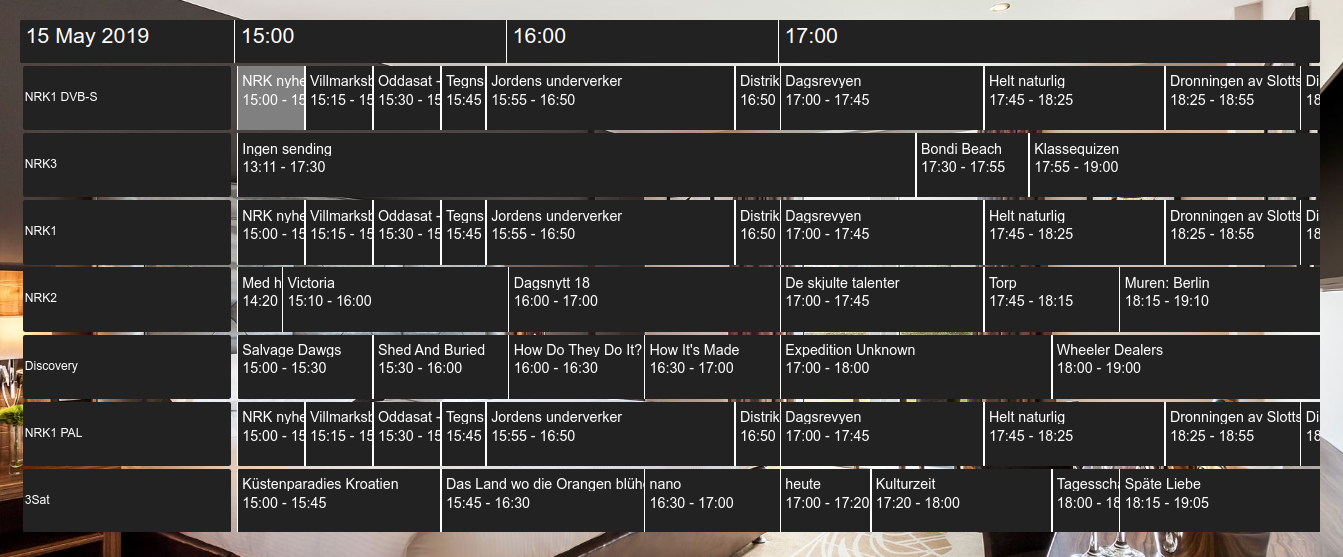
This element will render a navigable matrix representing a multi-day programme guide for all the channels in the current TV-channel table. Rendering, navigation - including scrolling etc is all built in.
Example:
NOTE
You need the Multiday EPG license for the EPG data to be available.
Content cannot be configured for this element
¶ .m-normal
This class it applied to the whole matrix element. If you want a background for the entire matrix, it can be set here.
¶ .m-highlighted
This class is applied to the whole matrix element when it is in the highlighted state. Keep in mind that the list will be in highlighted state as long as you can navigate it.
¶ .m-epg .m-title
Matches the header bar(the element showing the hour-line).
¶ .m-epgitem .m-normal
Matches all cells in the matrix.
¶ .m-epgitem .m-highlighted
Matches the highlighed cell in the matrix.
¶ .m-epgitem .m-epgitem-title
Matches all the epg-cells programme name fields. Use this to override basics such as font and padding.
¶ .m-epgitem .m-epgitem-time
Matches all the epg-cells time/diration name fields. Use this to override basics such as font and padding.
¶ .m-epgitem m-epgitem-channelname
Matches all the channel title cells in the EPG matrix. Use this to override basics such as font and padding.
¶ Element Height
The height of the lines in the component.
¶ Margin between elements
The spacing between all the elements in the matrix.
¶ Number of hours in page
The number of hours to render visible programme data for.
¶ Width of channel titles
The width in pixels of the box containing the channel name.
¶ Height of top-bar
The height in pixels of the top-bar.
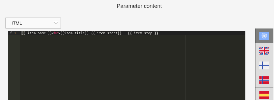
An item object representing the current highlighted EPG entry is available for templating on various events such as when the item is selected. It contains:
- name - The name of the channel that is currently highlighted
- title - The title of the current programme highlighted
- description - A description of the current programme highlighted
- image - An URL linking to an image representing the current programme highlighted. Can be null/empty.
- icon - The channel icon if available.
- start - The start time of the current programme highlighted - formatted like in the EPG matrix
- stop - The end time of the current programme highlighted - formatted like in the EPG matrix
You can add triggers for the following events:
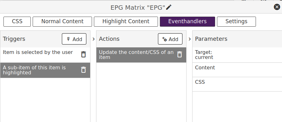
¶ A sub-item is highlighted
Fired when an element in the list is going from normal to highlight state. The item property described above is available when handling this event.
¶ A sub-item looses highlight
Fired when an element in the list is going from highlight to normal state.
Example
If you want to update another container based on the current highlighted EPG entry - add a "sub-item is highlighted" event:
Then under content use templating to render the information based on the above listed data. Eg:
¶ Templating
In most content editing, and many configuration settings, you can use the Mustache templating language to expand variables.
Let's assume we have the following page parameters sent to a new page:
{
  "title": My Title",
  "text": "Some text"
}
For a markup section we could then set:
<div>
 {{page.title}}<br>
 {{page.text}}
</div>
The mustache rendering engine will then output:
<div>
 My Title<br>
 Some text
</div>
The following objects are available to the templating engine:
-
page
As described above, parameters passed to the page, or default page parameters, are accessible via the page object. -
settings
A selection of system settings are available via the settings object. Settings might differ from screen model to screen model. See Global Variables for a list of populated variables. -
valueof
The valueof object can be used to retrieve data from other page elements that provide a value. This is typically used to get input data from the input element. Access the data by using the element name as the property, e.g. {{input.myInputElement}} -
item
This is a special object used only in the ItemList element and its sub elements(TV-Channels) to access data for an item in the dataset the element is based on.
Escaping of variables
All variables are HTML escaped by default. If you want to return unescaped HTML, use the triple mustache: {{{name}}}.This is useful in situations where you need a working URL, e.g. in slideshow, webcontent or webrequests.
¶ Global variables
| Variable | Content |
|---|---|
| settings.guest1Name | Name of the 1st checked in guest for the room associated with the screen. "Guest Name" if no guest. |
| settings.guest2Name | Name of the 2nd checked in guest for the room associated with the screen. "" if no 2nd guest. |
| settings.locationName | The name of the location the TV is registered to. |
| settings.duid | The unique device-ID of the screen. |
| settings.language | The currently applied language as set in the menu in 2 letter format. |
| settings.guestLoyaltyTierCode | The loyalty tier code set by the PMS (only supported by HotelKey) |
| settings.guestLoyaltyTierName | The loyalty tier human readable name set by the PMS (only supported by HotelKey) |
| ------------------------- | --------------------------------------------------------------------- |
| softAP.enabled | true if the built in TV softAP is enabled. Only available for Samsung Orsay/Tizen and LG WebOS |
| softAP.ssid | SSID of built in softAP. Only available for Samsung Orsay/Tizen and LG WebOS |
| softAP.key | Key of built in softAP. Only available for Samsung Orsay/Tizen and LG WebOS |
| ------------------------- | --------------------------------------------------------------------- |
| media.playingNameTv | Get the name of the current playing TV channel, if available. |
| media.playingIndexTv | Get the index of the current playing TV channel in the current channel-table. |
| media.playingIdTv | Get the ID of the current playing TV channel, if available. |
| media.playingIconTv | Get the URL of the icon of the current playing TV channel, if available. |
| media.playingNameRadio | Get the name of the current playing Radio channel, if available. |
| media.playingIndexRadio | Get the index of the current playing Radio channel in the current channel-table. |
| media.playingIdRadio | Get the ID of the current playing Radio channel, if available. |
| media.playingIconRadio | Get the URL of the icon of the current playing radio channel, if available. |
| media.activeSubtitleLanguage | Get the (iso-639-1)language code representing the current-active subtitle language. |
| media.activeSubtitleFlagUrl | Get a relative path to a language flag icon representing the currently active subtitle language. |
| media.closedCaptionsEnabled | Get closed captions enable state. True or false. |
| ------------------------- | --------------------------------------------------------------------- |
| messages.unreadCnt | Number of unread messages in the inbox. |
| messages.hasUnread | true if there are unread messages(for use with templating conditionals). |
¶ Functions
Certain dynamic functions can be called from the Markup of containers. These are enclosed within hashes #
Example:
Currently playing:<br>
#getTime(HH:mm)# - #getEpgCurr()#
...might be rendered as:
Currently playing:<br>
13:00 - Some TV Show
The following functions are available:
¶ getSoftAPSSID()
Returns the SSID of the built in soft access-point of the screen, if active. Returns empty string if not.
DEPRECATED - use softAP.ssid instead
Only available for Samsung Orsay/Tizen and LG WebOS
¶ getSoftAPKey()
Returns the key(password) of the built-in soft access-point of the screen, if active. Returns empty string if not.
DEPRECATED - use softAP.key instead
Only available for Samsung Orsay/Tizen and LG WebOS
¶ getActiveSubtitleLanguage()
Returns a (iso-639-1)language code representing the current-active subtitle language.
DEPRECATED - use media.activeSubtitleLanguage instead
Only available for Samsung Orsay/Tizen
¶ getActiveSubtitleFlagUrl()
Returns a relative path to a language flag icon representing the current-active subtitle language.
DEPRECATED - use media.activeSubtitleFlagUrl instead
¶ getFlagUrl(iso-639-1 language code)
Returns a relative path to a language flag icon if it exists. If not, it returns a path to a generic flag icon.
Currently supported languages:
'ar', 'az', 'bg', 'da', 'de', 'dk', 'en', 'es', 'et', 'eu', 'fi', 'fr', 'bg', 'ge', 'he', 'hr', 'hu', 'ir', 'is', 'it', 'ka', 'kk', 'lt', 'lv', 'mk', 'nb', 'nl', 'no', 'off', 'pl', 'pt', 'ro', 'ru', 'se', 'sl', 'sq', 'sr', 'sv', 'tr', 'uk', 'un', 'zh'
Typically used in combination with the local subtitle or audiolanguage datastores.
¶ getTime(format)
Returns the current system time as formatted by the format parameter.
Format:
m - minutes
mm - minutes, padded to two digits
h - hours, 12 hour format
hh - hours 12 hour format, padded to two digits
H - hours, 24 hour format
HH - hours, 24 hour format, padded to two digits
D - day
DD - day, padded to two digits
DDD - weekday name, short version
DDDD - weekday name, full version
S - numer ending for day of month: th, st, nd or rd
M - month
MM - month, padded to two digits
MMM - month name, short version
MMMM - month name, full version
YY - year(two last digits)
YYYY - full year
t - AM/PM indicator a or p
tt - AM/PM indicator am or pm
T - AM/PM indicator A or P
TT - AM/PM indicator AM or AM
o - Timezone offset
Z - UTC offset string(eg UTC+0200)
o - short UTC offset string(eg +0200)
Example getTime("HH:mm DD.MM.YY")
¶ formatTime(timestamp, format)
Format a timestamp for display. The timestamp string must be on a format that can be parsed by the JavaScript Date object.
The format definition follows the same syntax as for the getTime function.
¶ getPlayingChannelName(type)
Returns the name of the last tuned channel of the provided type. Type can be tv or radio, e.g. getPlayingChannelName(tv)
Deprecated - use media.playingNameTv or media.playingNameRadio
¶ getPlayingChannelId(type)
Returns the channelId of the last tuned channel of the provided type. Type can be tv or radio, e.g. getPlayingChannelId(tv)
Deprecated - use media.playingIdTv or media.playingIdRadio
¶ getEpgCurr(channelId)
Returns the current running program for the defined channelId
¶ getEpgDescCurr(channelId)
Returns the description of the current running program for the defined channelId. Note, this can be a long string and formatting for overflow must be taken care of in markup.
¶ getEpgCurrProgress(channelId)
Returns an integer between 0 and 100 representing the progress of the current running programme. Can be used to build a progress bar.
¶ getEpgNext(channelId)
Returns the next program for the defined channelId
¶ getEpgDescNext(channelId)
Returns the description of the next program for the defined channelId. Note, this can be a long string and formatting for overflow must be taken care of in markup.