Dynamic Layouts are a combination of layout editor and widget tooling that can be used to design purpose-built layouts for content sourced as a data set. It cannot be directly deployed to a Schedule, but end users can create one or more Dynamic Layouts in the self-titled module before inserting into a Signage template via the Dynamic Layout widget.
The editor provides an abstraction for non-technical users to create customized layouts for data-based content without being restricted by the availability of certain Widgets or configuration settings in the Signage Template concepts. The maintenance of a Dynamic Layout is held separate from the inclusion of the Dynamic Layouts widget in a Signage Template as Dynamic Layouts are managed within the dedicated module.
¶ The Editor
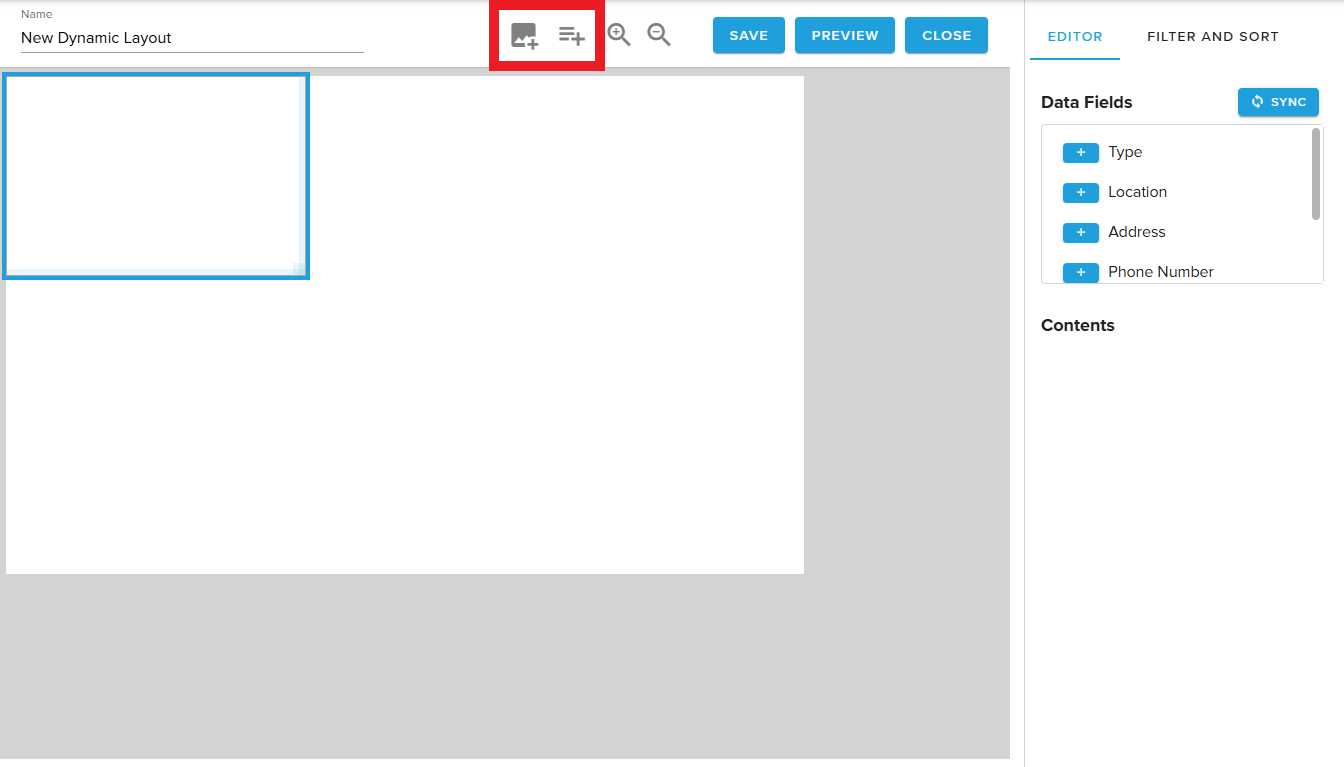
The Dynamic Layouts editor is available under Content -> Dynamic Layouts by double-clicking an existing layout or choosing “New Dynamic Layout” along the top.
¶ Connect a data source
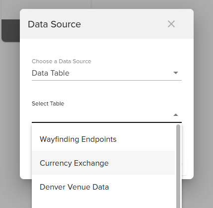
Choose Add Dynamic Layout and specify your Data Source. Currently, available data sources include Tables in Hub.
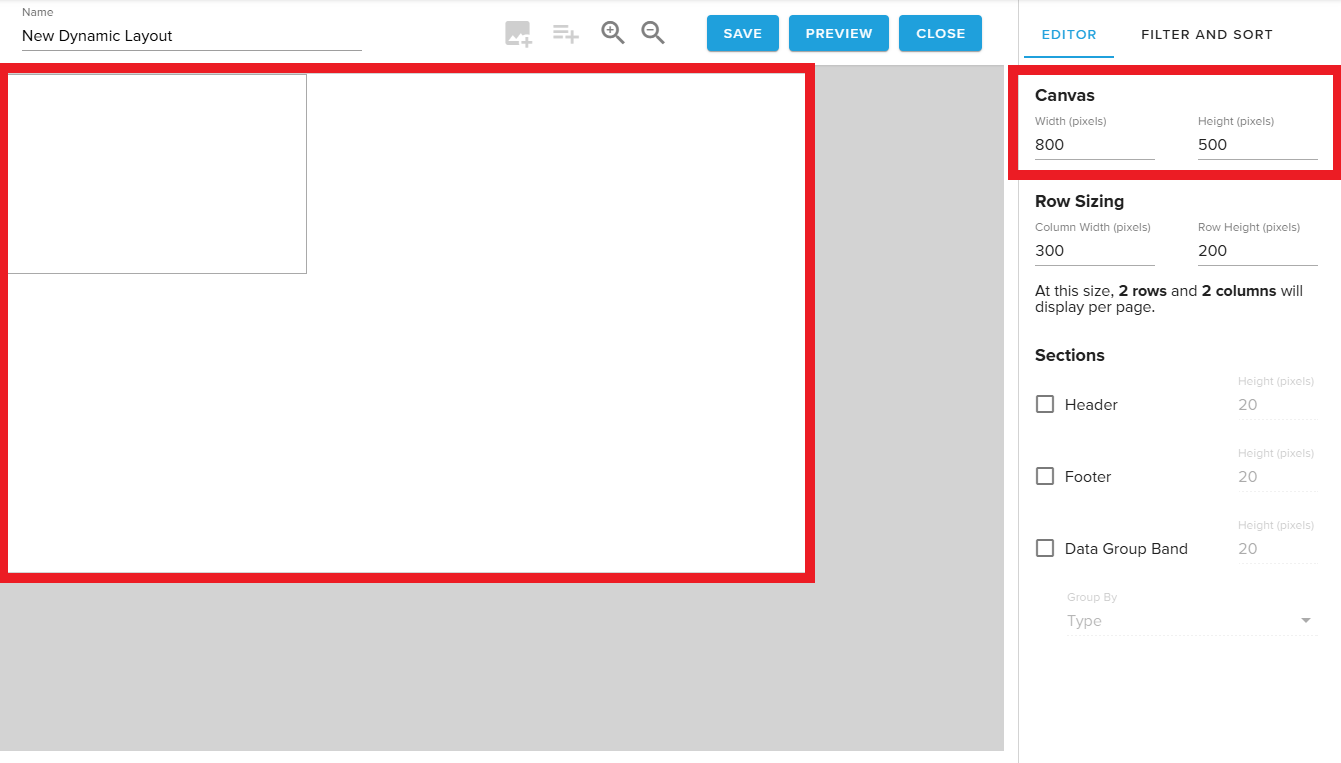
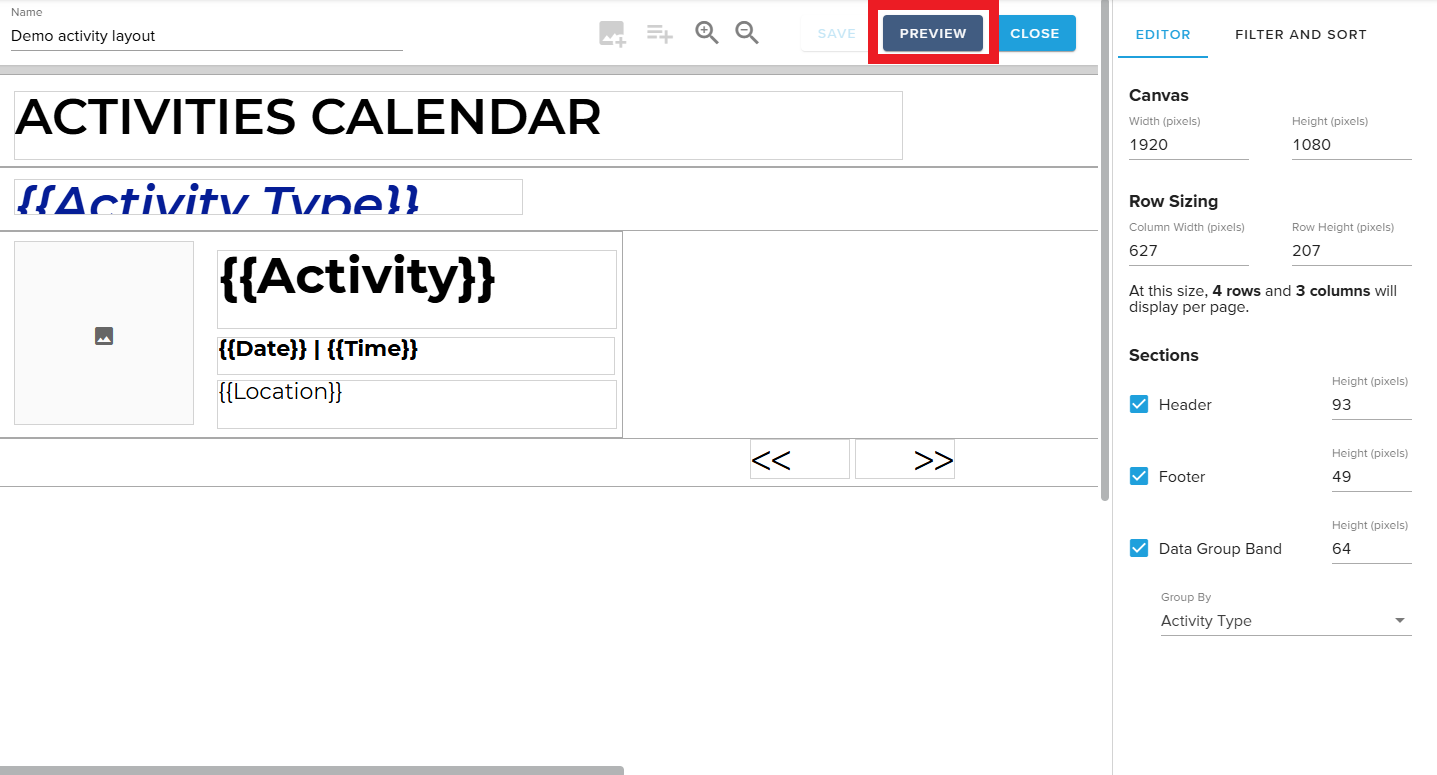
Canvas Preview
Dynamic Layouts are intended for display on a signage template.
The Canvas Preview tool allows users to set the size of the white background, which represents the area that the Dynamic Layout is intended to occupy on the template.
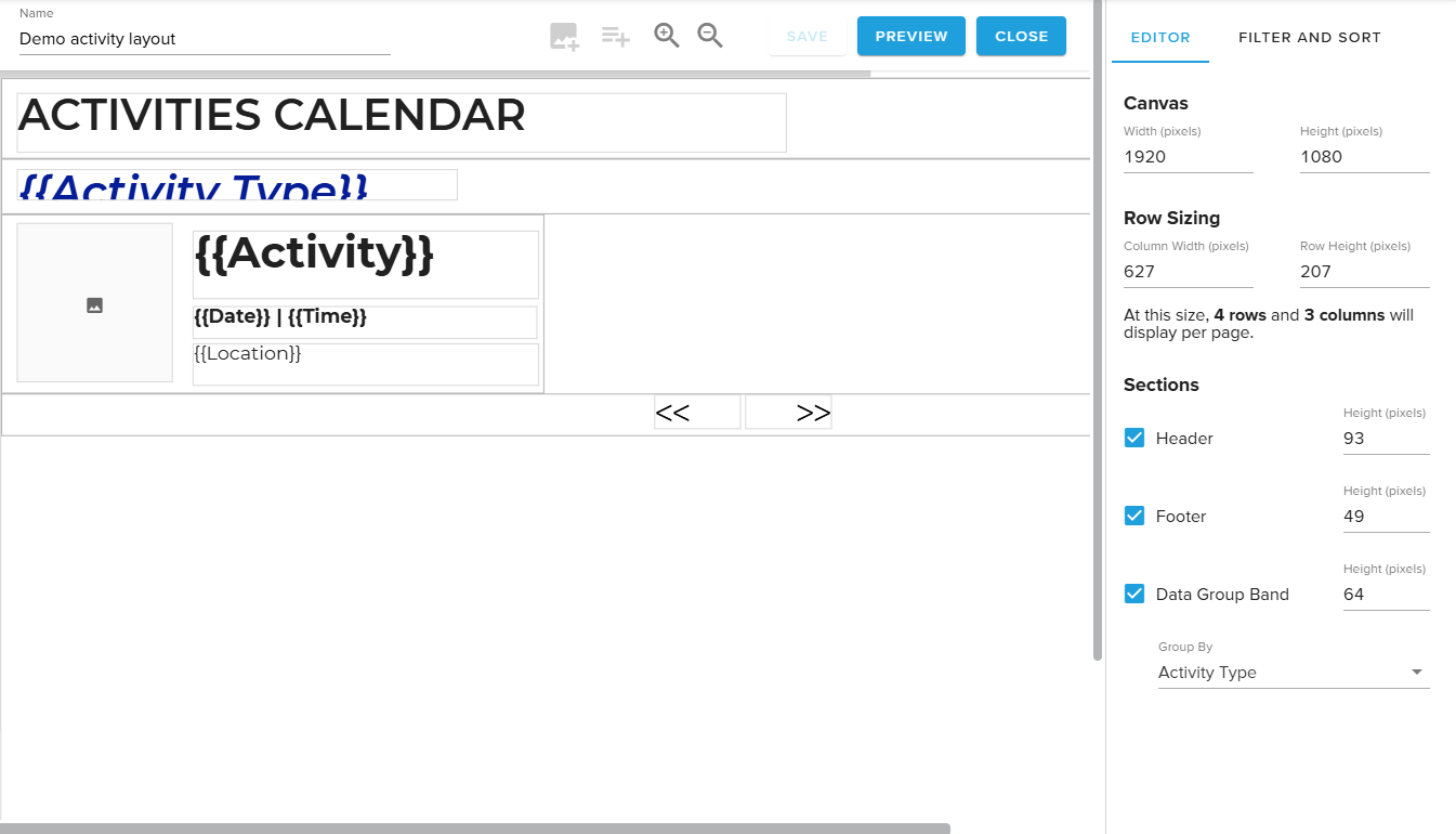
¶ Data Bands
The Dynamic Layouts editor allows users to design their layout by inserting static or dynamic fields into four different kinds of data bands.
¶ Row Band
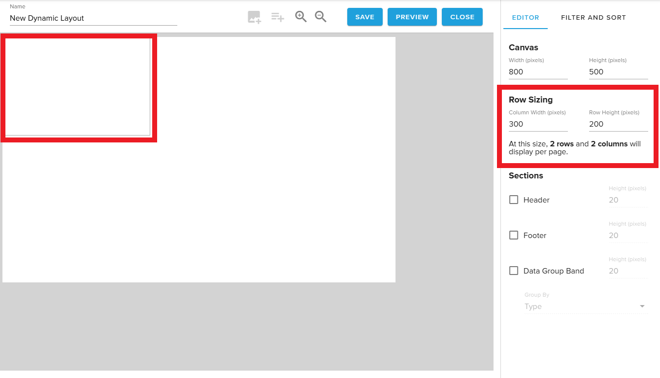
Dynamic Layouts visually interpret rows of a data set. This tool allows users to specify how wide and tall each row of data should be.
The editor compares this sizing to the Canvas Preview dimensions to provide users with an estimate of the quantity of rows and columns that will fit on the Canvas.
Header Band
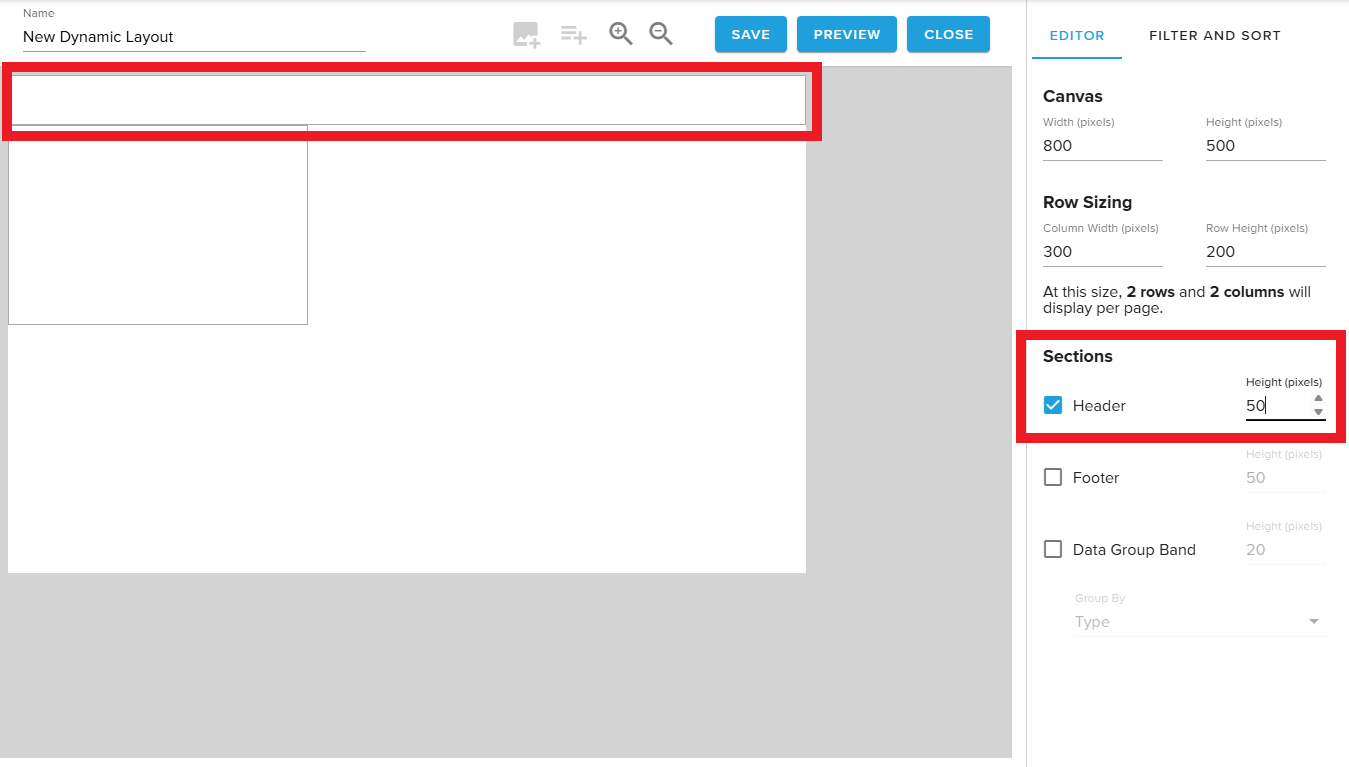
Display static text fields like labels.
Footer Band
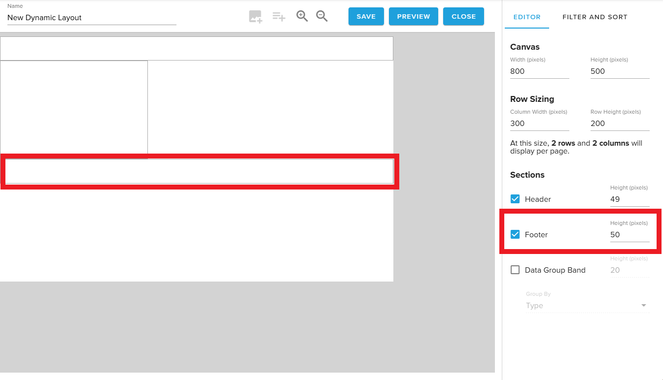
Display static text fields as well as pagination controls.
¶ Data Group Band
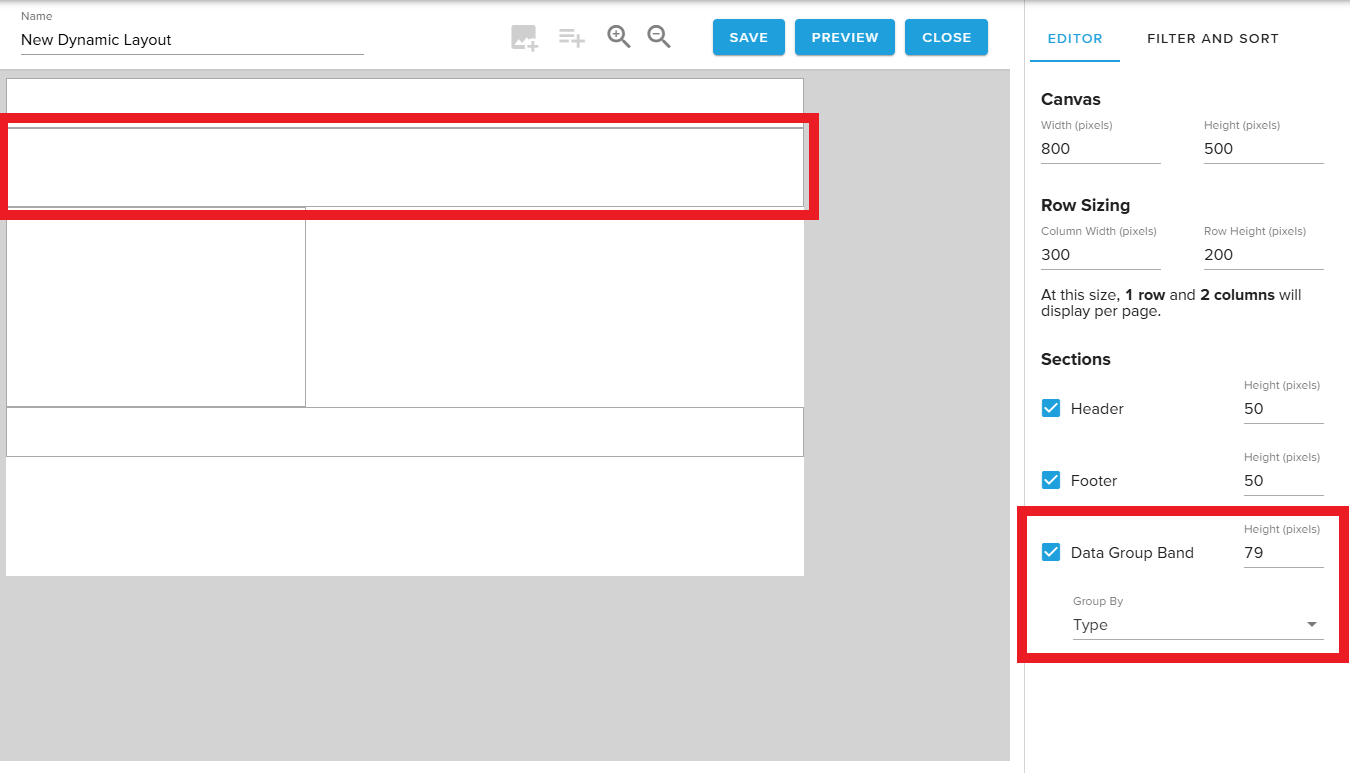
Reference a column that has matching values across rows to group data together.
For example, in a menu’s Item Category column, items like Eggs and Toast might both use the value Breakfast while coffee and soda share Drinks.
¶ Managing Data Fields
New data fields may be added by either choosing the + icon next to the desired column header in the Data Field selector or by choosing the Add Text or Add Image buttons from the top banner.
¶ Add a new data field
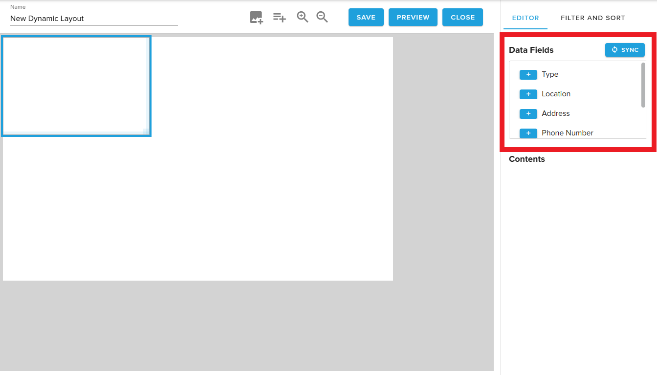
Selecting the Row Band brings up the Data Field selector.
Press the + icon next to the desired field (represented by the column header from the connected Table) to add a new field.
Alternatively, you may select the Insert Image or Insert Text Box icons to create a new data field.
¶ Edit an existing field
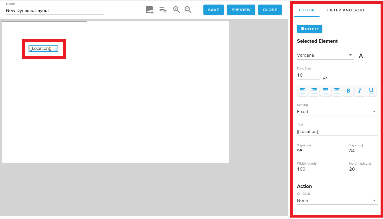
When a Text type field is selected, the menu on the right automatically updates with configuration settings for the field.
Users may set styling, font scaling behaviors, change the field location and size, or assign interactivity Actions.
¶ Customizing data fields
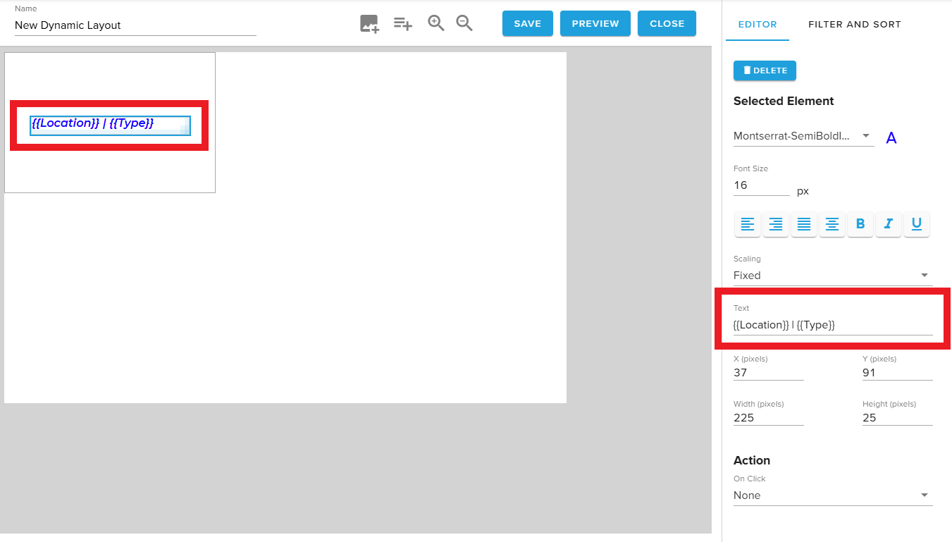
Users may also select the Text parameter to hard code static elements like brackets, ampersands, and dollar signs, or type the name of another field in double curly brackets {{ }} to combine multiple values in a single field.
¶ Image type fields
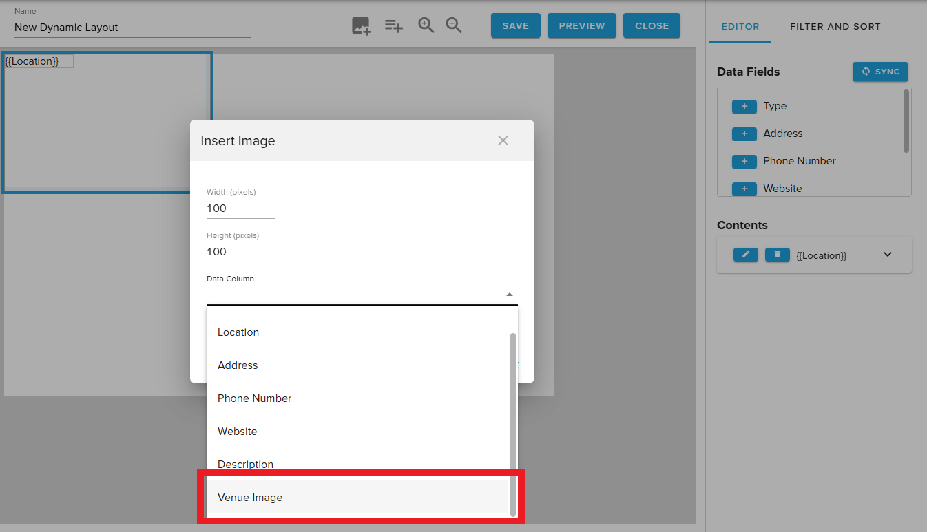
When “Insert Image” is selected, users are prompted to specify the width and height of the new field and connect a column from their data set.
When the content is displayed, it will check for references to image locations in this column and display an image, if found.
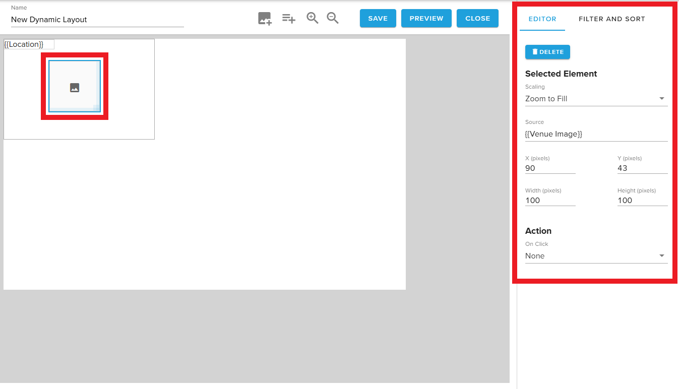
When an Image type field is selected, the menu on the right automatically updates with configuration settings for the field.
Users may set a scaling behavior of Zoom to Fill or Fit in Container, update the source, change the field location and size, or assign interactivity Actions.
¶ Managing Existing Fields
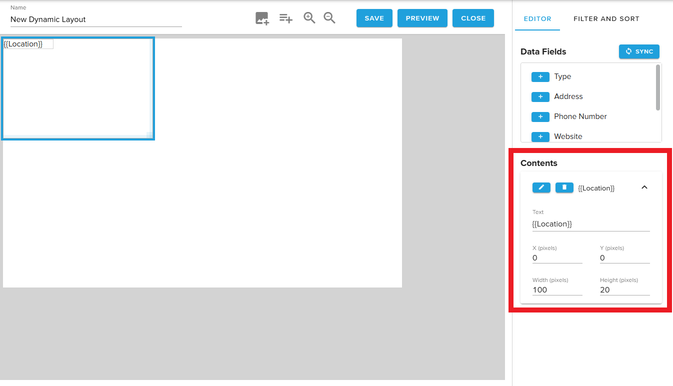
The Contents section automatically populates when new fields are added.
Users may choose the trash bin icon to delete a field.
Alternatively, the carrot on the right may be selected to expand the field and quickly update the text, XY coordinates, or dimensions of the field.
To adjust the font and styling, users may select the pencil icon.
¶ Selected State Settings
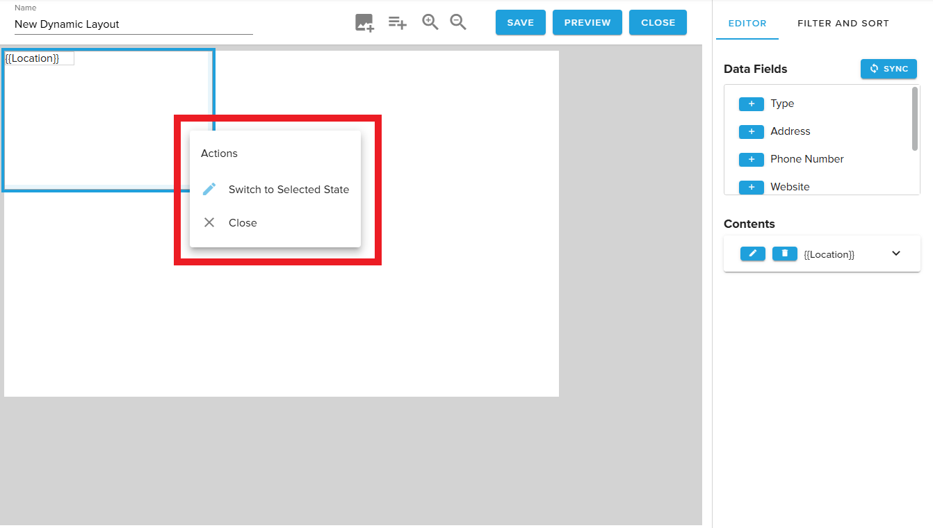
When solutions requiring either interactive displays or automatic row highlighting (to simulate touch) are created, a Selected State helps the highlighted row to stand out.
Selected state settings are entirely unique to the default state.
¶ Filter & Sort
Users may Add Filter & Sort configurations to this tab to control what content from the data source displays, and in what order.
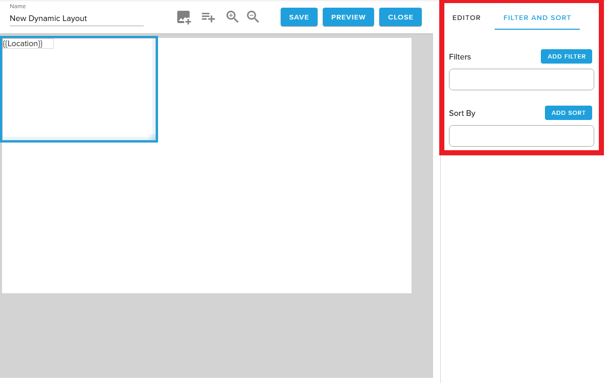
¶ Filter
Dynamic Layouts support the use of multiple filters to refine which rows from the data source are eligible for playback. Users may add filters that should be compared using AND or OR, a setting which is toggled using the radio button.
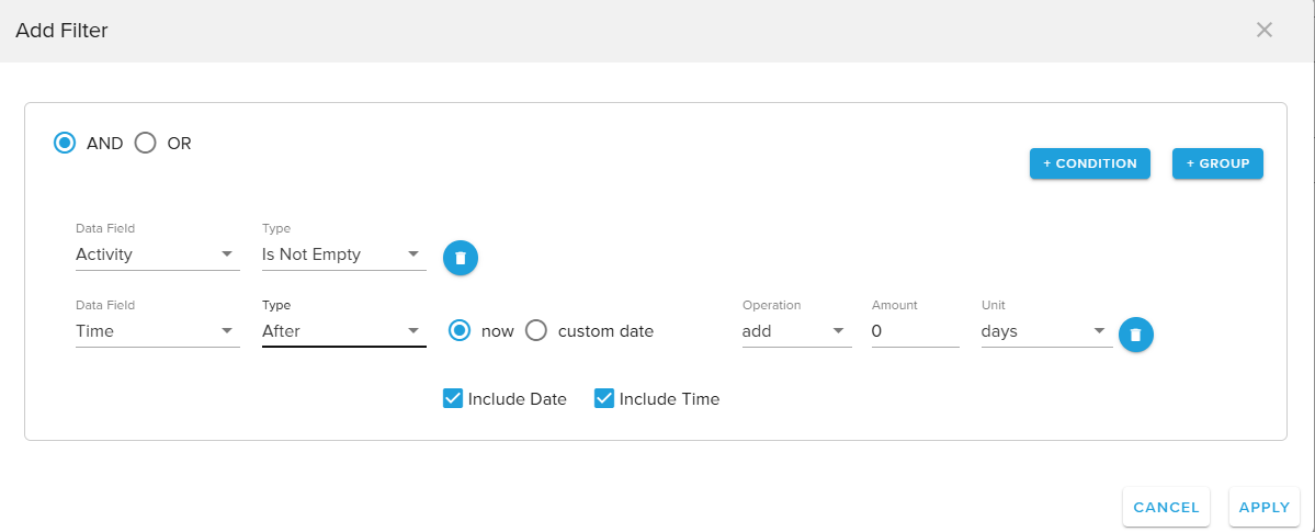
Additionally, filters may be added in Groups. When a filter is added in a Group, all of the grouped conditions are evaluated before the Group is compared to other individual or grouped filter conditions.
Filters support the below comparison types:
- Equals / Not Equals
- Is Empty / Is Not Empty
- Less Than / Greater Than
- Contains
- Starts With / Ends With
- In
- Before / After
When using Before and After, the filter expects a date value in the assigned column. Ahead of a formal update to Tables that will generate a Date/Time field type, please use the following date formats for this to properly work:
2025-07-17T14:52:00 (Date & Time) or 2025-07-17 (Date only)
When finished, select Apply to save changes. The filtering behaviors will take effect next time the Preview window is opened or the Dynamic Layout displays as part of a widget.
¶ Sort
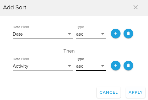
Dynamic Layouts also allows multiple sort orders to be applied in order to determine what order rows will display.
Users may select the + icon to add a new sort, specify the desired field to sort by, and choose ascending or descending.
To delete a sort rule, select the Trash Can icon.
Select Apply to save changes. The sort order will take effect next time the Preview window is opened or the Dynamic Layout displays as part of a widget.
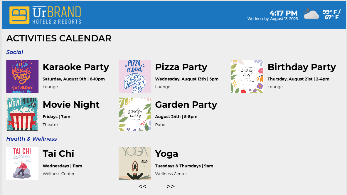
¶ Preview function
At any point, users may select the Preview button along the top banner. This will open a new window that renders a preview of their design including filter and sort behaviors.
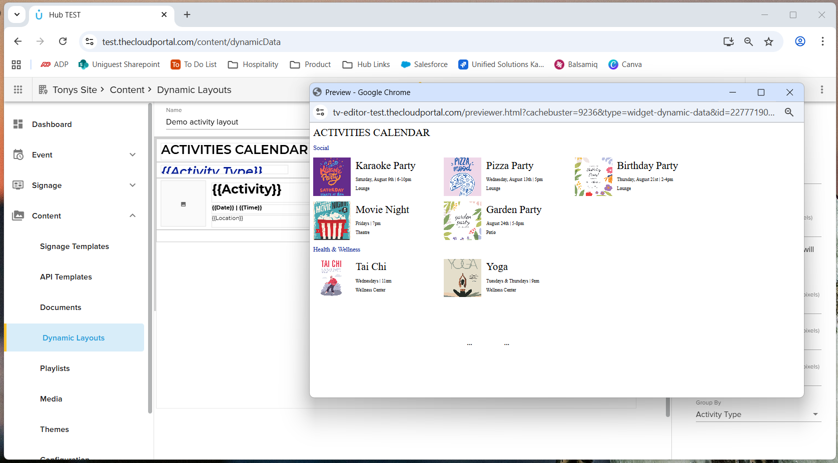
Please note that not all fonts are supported in the preview window and in this case users must preview content by adding a Dynamic Layout widget to a template in the Signage Templates editor.
¶ Saving Changes
To save changes to a layout, choose the Save button along the top banner. When changes have been saved, the button will display in a disabled state.
To close a layout and return to the Dynamic Layouts folder, choose the Close button along the top banner. If changes have not been saved when the Close button is selected, the editor will prompt a user to save or discard their edits.
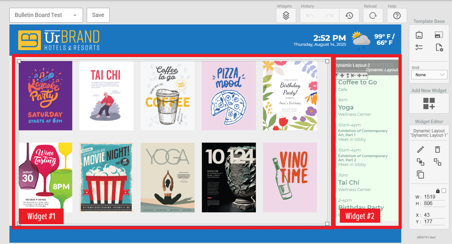
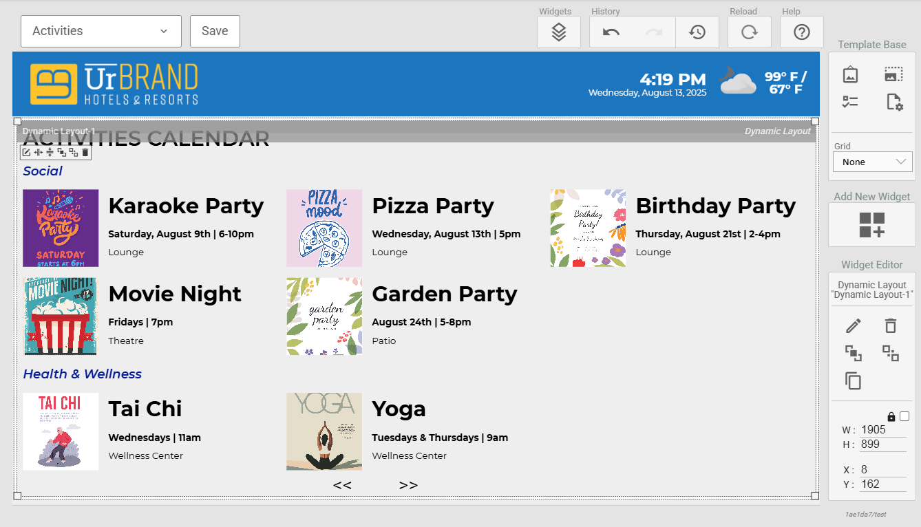
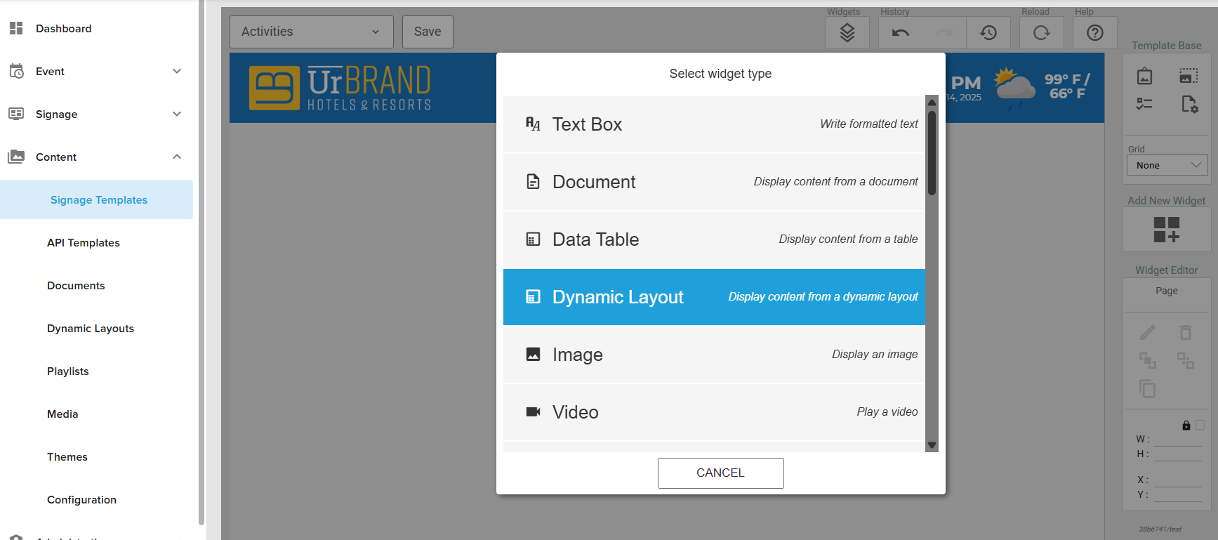
¶ The Widget
Dynamic Layouts authored in the new module are connected to a new widget in Signage Templates. This works like the current Documents editor + Documents widget.
¶ Widget Configuration
Additional settings may be applied to the Dynamic Layouts widget to customize playback behavior.
¶ Source Tab
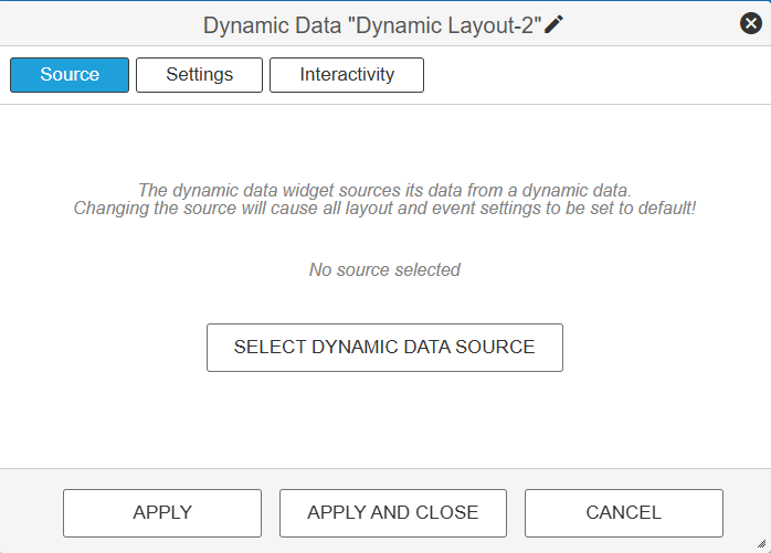
Choose which Dynamic Layout, created in the layout editor, to connect to this widget.
Settings Tab
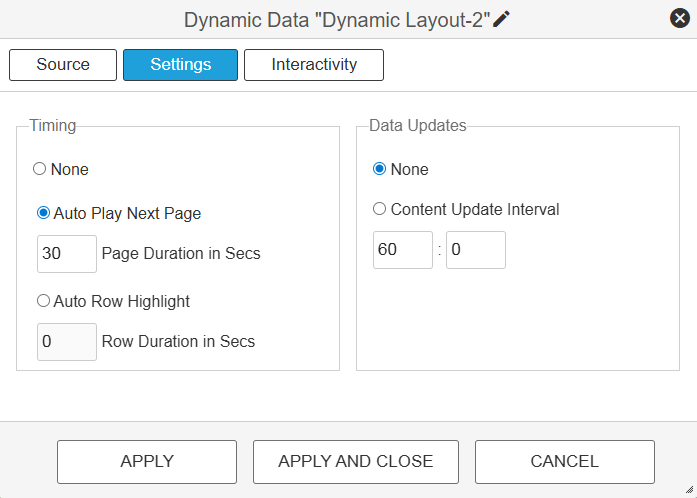
Specify pagination behaviors and timing
Auto Row Highlight simulates touch on non-interactive displays
Customize data source update interval
¶ Interactivity Tab
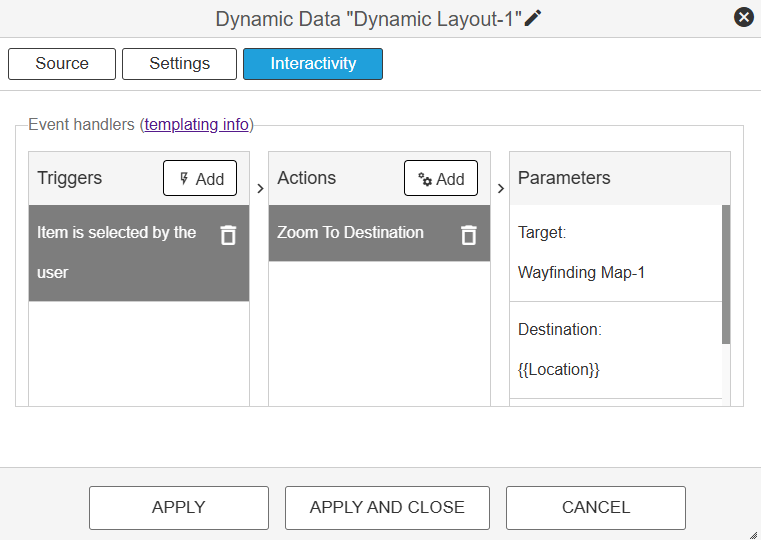
Customize Triggers and Actions based on the selection of a row of data.
Using multiple Dynamic Layout widgets in a single template
Users may choose to combine instances of a Dynamic Layout to achieve their required design. To do so, simply choose “Add widget” to populate the template with multiple Dynamic Layout widgets and arrange as needed.